Hello Design Colleagues!
Last week we revealed our new 2019 Spring Summer Featured Collections… we hope you are loving them! (If you missed that email, check them out here.) If you would like to schedule a presentation with one of our great Architectural Sales Consultants to see these new collections, please send us an email.
This season we began exploring some new design ideas and concepts with our featured collections, as well as some of our other design oriented, budget friendly collections. Since being with Creative Materials, I’ve looked at A LOT of manufacturer catalogs and brochures. This has given me the opportunity to see what works and what doesn’t work when showing tile. Some manufacturers focus heavily on installation photos and/or renderings and then fail to show the defining characteristics or details of the tile itself or vice versa. This can make it difficult when showing a product to your client if you don’t have the tools to communicate your vision or the time to fully develop how the product will look in your space. Here’s where I hope our Design Concepts for Tile will help because we’ve explored how the material will show in the space, and we’ve also illustrated the details and characteristics of the tile.
The Design Concepts for Tile is a series of ideas and looks created by the Design Services department at Creative Materials. We drew inspiration for our spaces from different areas of Hospitality Design… the lobby, check-in, restaurant, and café spaces found in a hotel. We created different palettes to reflect different vibes for each rendering… ranging from eclectic to transitional to sophisticated to bold. The renderings show the materials as they would appear in the space but this does not always show the finer details.
To capture these finer details, we photographed our HQ panels which were inspired by these Design Concepts. (We update these panels each time we roll out new featured collections.) This gives you to the ability to see interesting and unique characteristics of the tile that wouldn’t be visible in the renderings.
Why are we creating Design Concepts for Tile? We want to show you the composition of materials as it defines a space, as well as the subtle nuances of the tile, which can only be seen up close. We hope to capture both of these ideas in our Design Concepts for Tile.
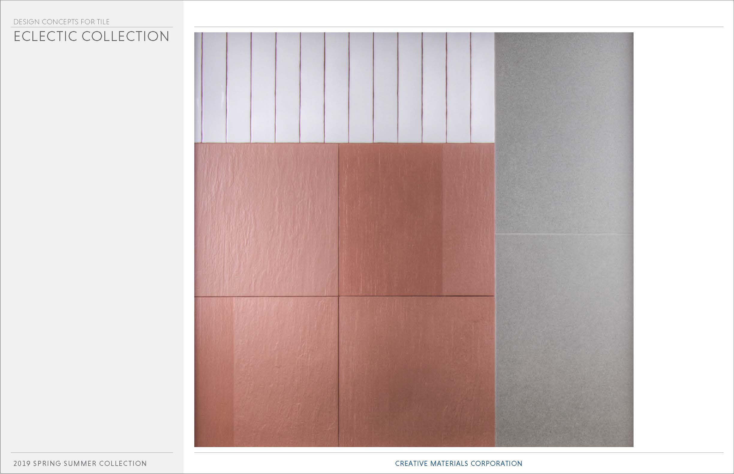
Our Eclectic Collection is probably one of my favorites. The idea behind this concept was to create an edgy and fun hotel check-in space. We wanted the walls and vertical materials to be the eye-catching elements in the space and wanted the floors to have a serene, minimalist feel. The Rose color from Juxtapose gives a playful horizontal movement across the wall with its mix of finishes and textures, and its great elongated format. Instead of painting the wall above the Juxtapose, we wanted to add more visual interest and texture to the wall. We ran the Chroma White perpendicular to Juxtapose; Chroma has an irregular edge that could give it a rustic aesthetic, but the format in a vertical orientation, pushes this look to contemporary. We also selected a Terracotta grout color that matches the Juxtapose which we ran up through the Chroma to connect the two areas. Chroma is also used on the front of the desk with a great wall covering from LondonArt. The pattern of Chroma is a nod to the fret and fretboard of the neck of a guitar. We also used matte black details throughout the design for a nice contrasting element against the tile. I love how the colors and materials came together for this design.
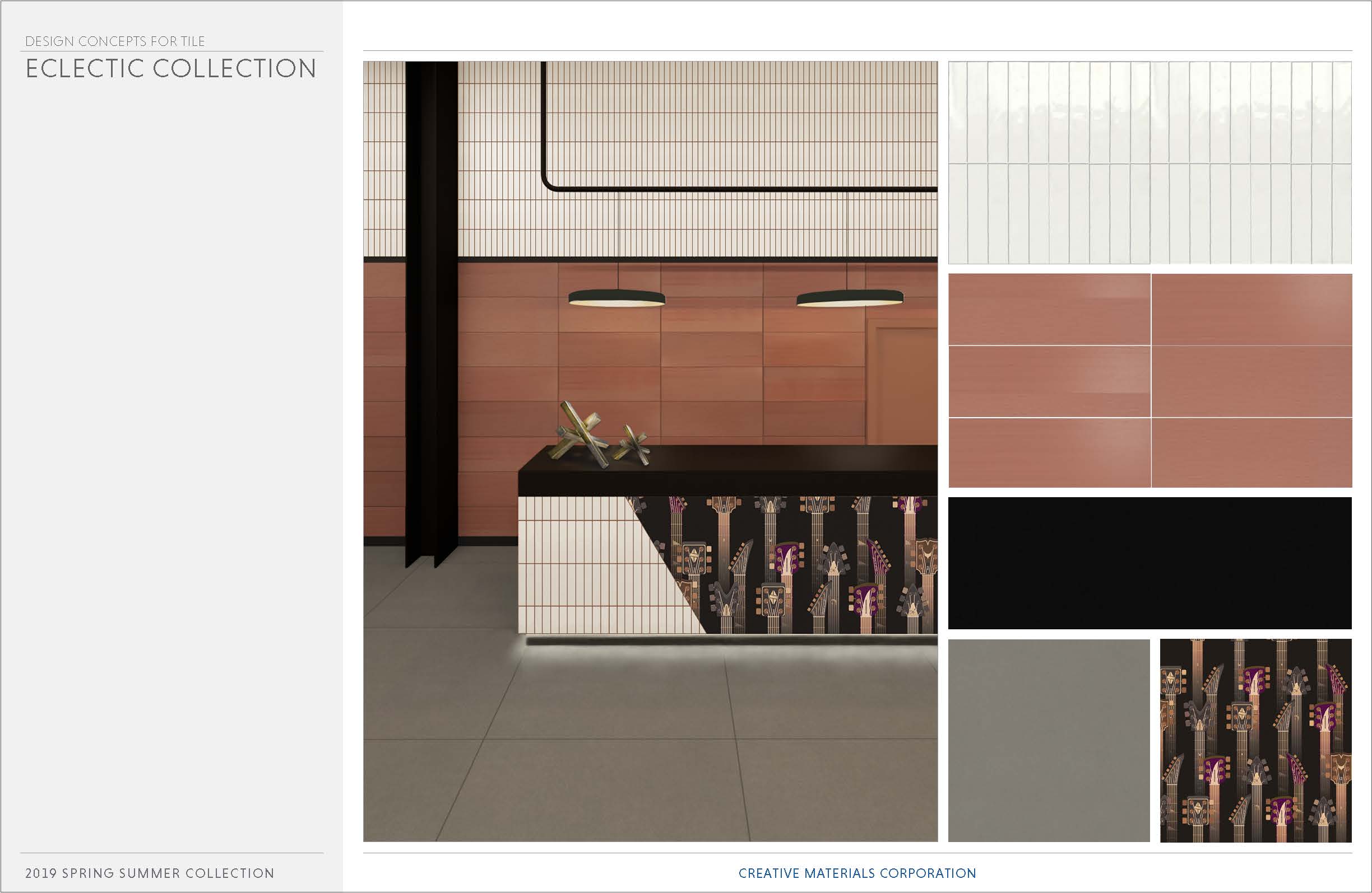
The Eclectic Collection features the following tiles and grout colors:
Request samples of Pietra Serena, Juxtapose, and Chroma.
The idea behind the Sophisticated Collection was to create a chic, elegant business/ meeting space for a hotel. We wanted to showcase Ceppo di Gre, a popular and rare natural stone that is replicated into porcelain. This stone has a great organic quality to it and is very unique. We liked how the colors of the Ceppo complemented the subtle blue-grays within Nimbus White. Nimbus is a perfect example of a material that needs to be shown in a large installation and also has close-up images showing the details of the material. Nimbus is a concrete-looking tile with a glossy resin-like glaze that flows over the tiles’ irregular body. The glaze doesn’t cover the entire surface of the tile, it leaves some of that concrete-like body exposed, creating a playful bounce of light over the varying finishes. Another interesting detail on Nimbus White that wasn’t noticeable until the material was grouted, was the fine dark gray edge on the tile. This edge can easily be emphasized with a dark grout or the individual pieces can be emphasized by using a grout color that complements the soft blue-gray color that flows across the white surface. We also choose a vertical orientation for Nimbus to give a contemporary feel to the material. To break up the length of the wall and delineate a different area within the space, we used Cementing, a concrete aesthetic with subtle mottling in Dark Gray. The material becomes a great backdrop for artwork within the space and a way to break up the long expanse of Nimbus, which has a higher price point than Cementing.
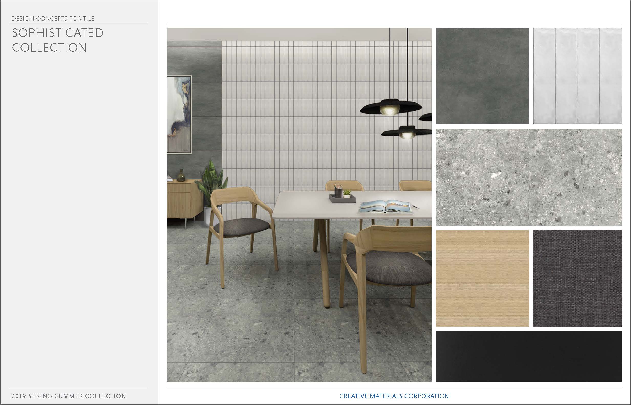
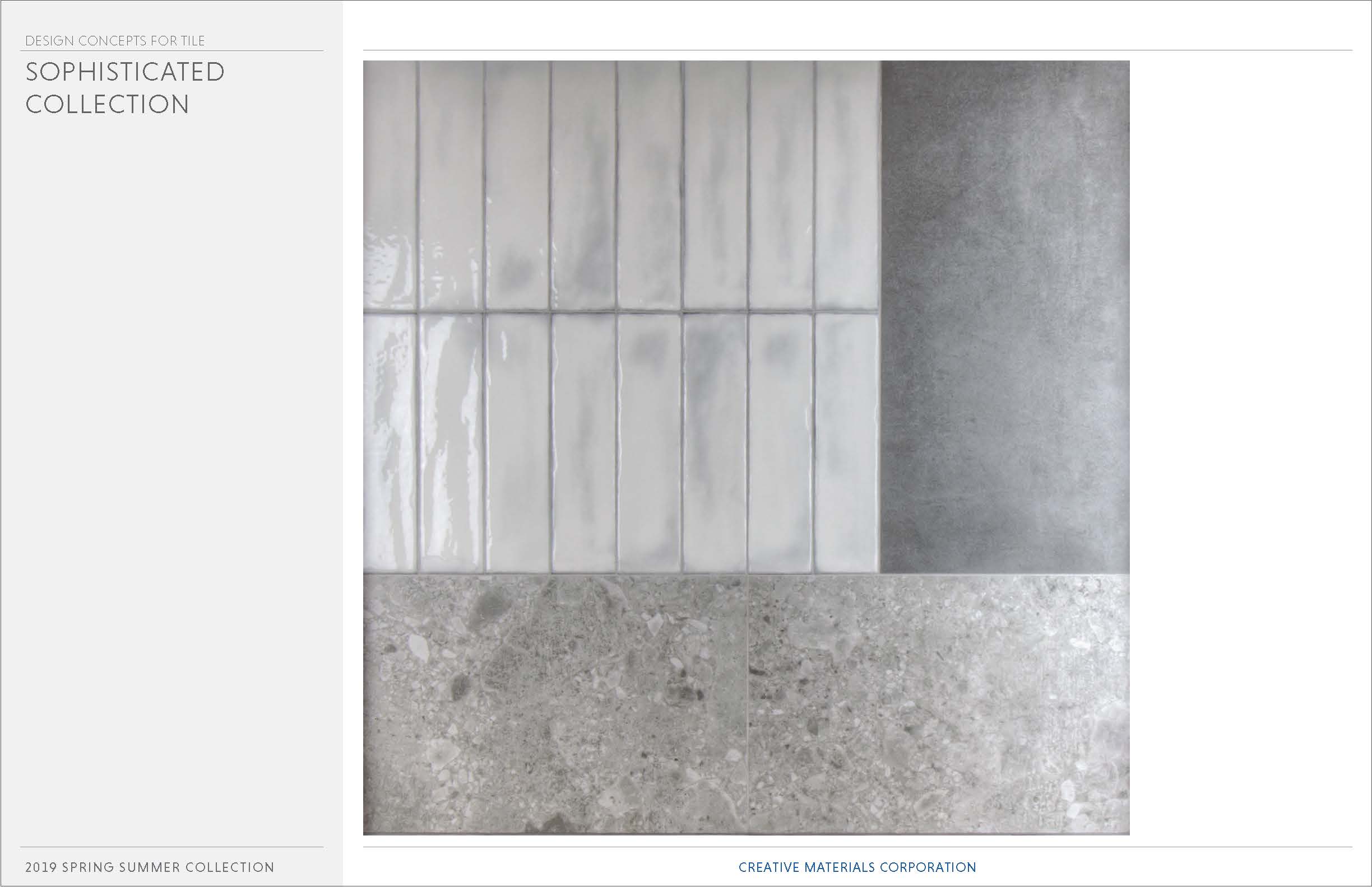
The Sophisticated Collection features the following tiles and grout colors:
Request samples of Ceppo di Gre and Cementing here.
Our renderings are obviously emphasizing a lot of hard materials, which may not be realistic for every space, but soft materials like area rugs or window treatments could be integrated to provide softness under foot or help with sound absorption. Our goal was to give you ideas of different ways to combine and orientate materials within a space.
The funny thing is, we felt like we were back in studio creating these designs. However, there were no program or project parameters, which made this very challenging and we were shocked by that. You’d think that if someone said to you, “please design anything you want from scratch”, you’d be like “Sweet, that’s awesome! That’s easy peasy!” Nope, it wasn’t as easy as I had hoped for. That being said, if there is a space you would like to see in our next set of renderings, please email us! We’d love to hear what you’d like to see.
These concepts were created in Revit and Photoshop. The layouts were formatted in Adobe InDesign. If you have a project where you’d like the Design Services department to assist in the development of your design or pattern layout, please send us an email to [email protected]. We look forward to creating with you soon!
Until next time…
E