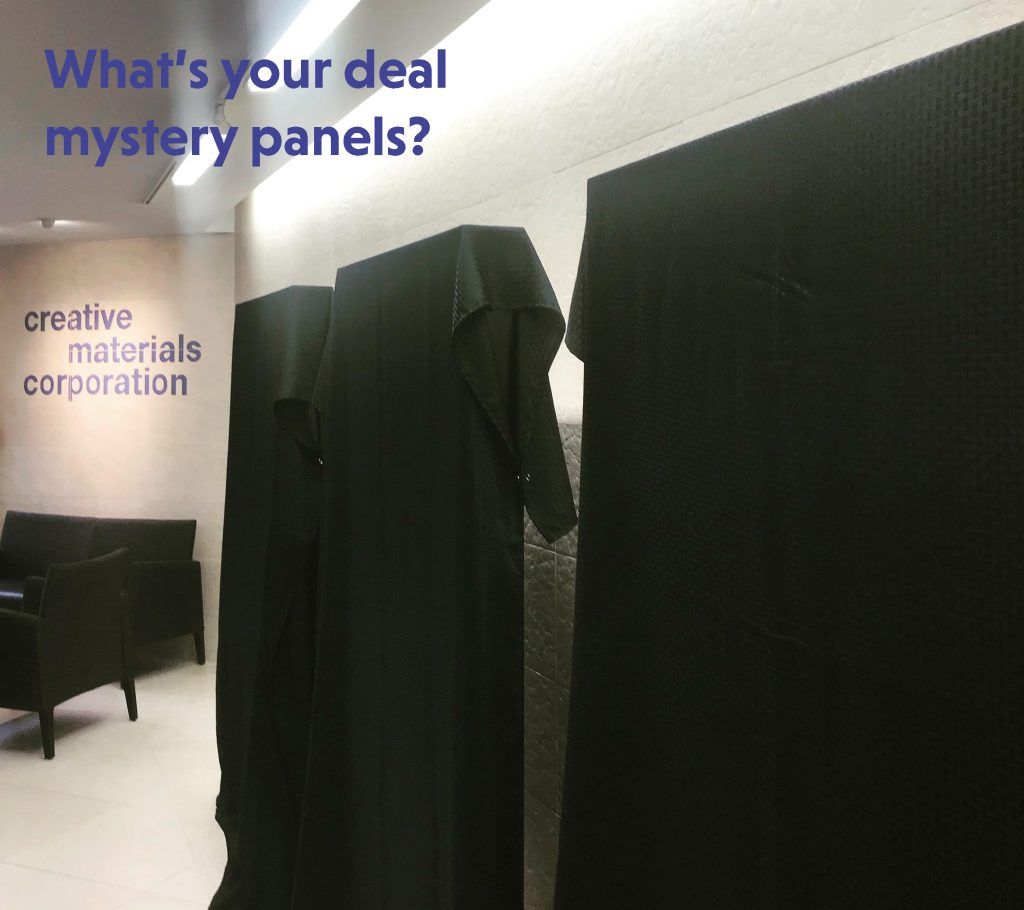
You may have noticed on social media that when we are close to rolling out our spring/summer and fall/winter feature collections, we show mystery panels covered with black tablecloths… so what’s the deal with that? Well, they are panels that I design and a few good fellows in our sample warehouse, Steve and Dan, construct each season to showcase our new collections.
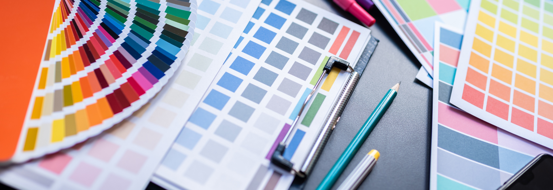
These panels allow me to be creative and combine collections that work well together or illustrate the breadth of a single collection. These panels also give me the opportunity to play around with different grout colors so I can see how it looks if I use a dark color against a light tile and vice versa. Sometimes I surprise myself and other times it’s a miss. Either way, it’s a great learning experience. I think grout selection is something that designers dread, but here at Creative Materials, we want to take away that angst. We are creating grout color options for all of the tile colorways within the 2018 Fall Winter Collection. We’ll let you know when they are available and what the thinking is behind the selections.
We reveal the panels to our employees in order to teach everyone about the new collections and get them as excited about them as we are. Now I’m revealing them to you!
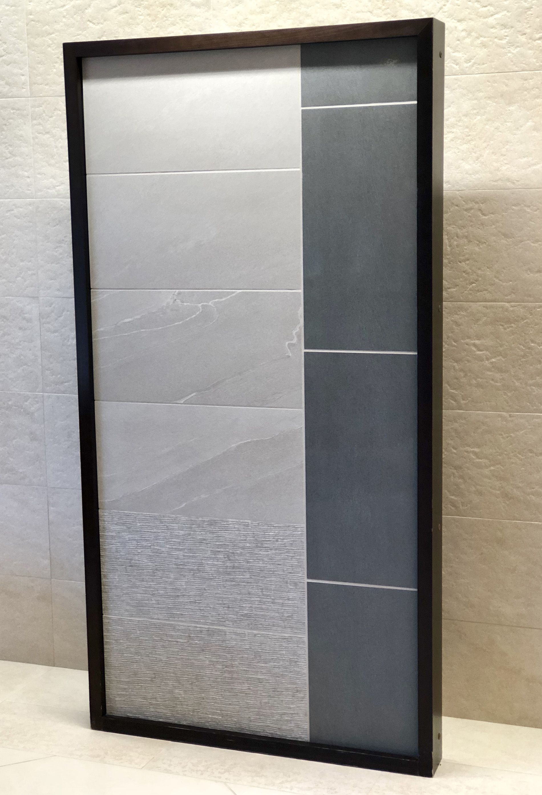
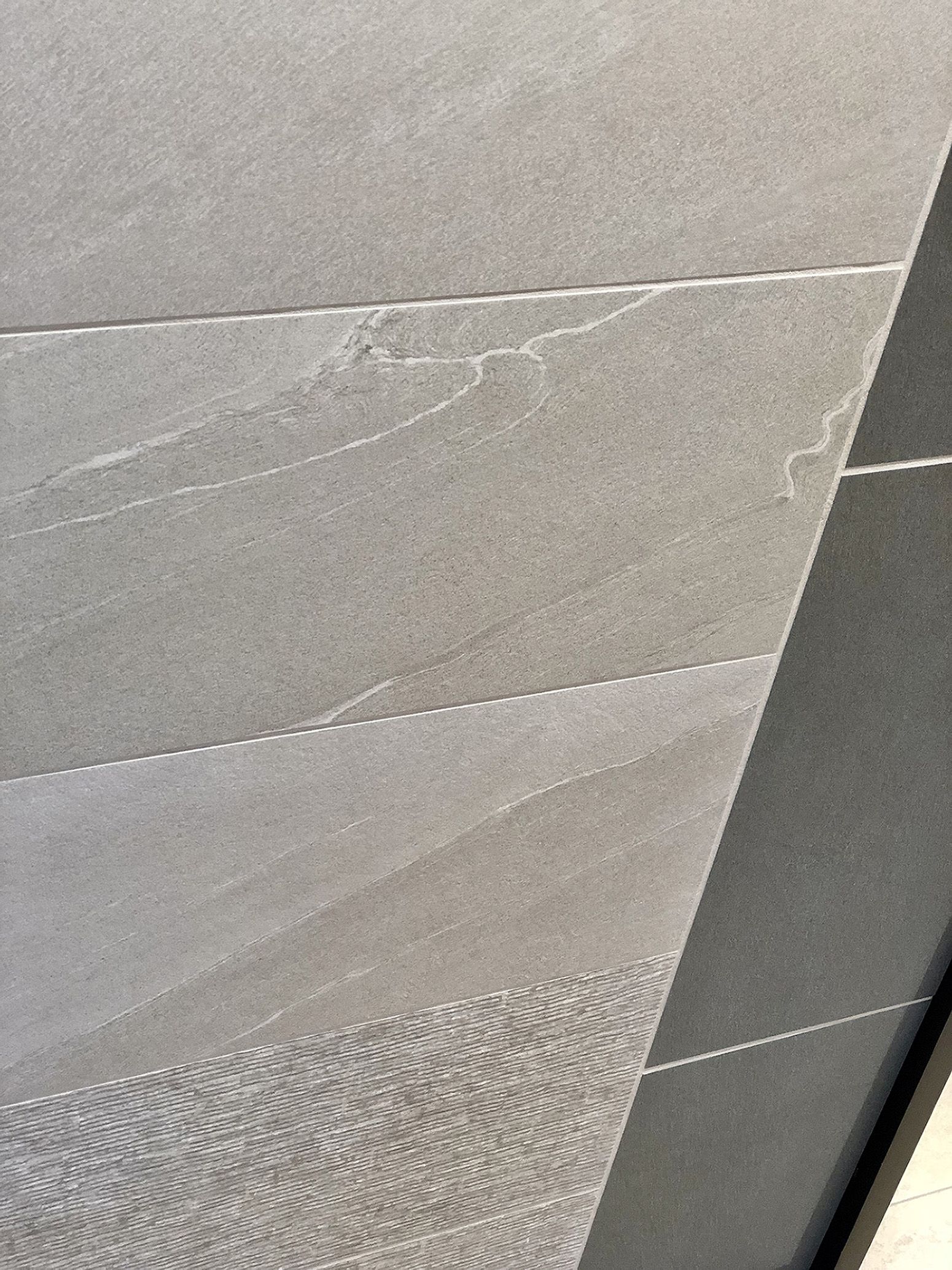
Panel #1 features Phases and the changes in aesthetic and texture that occur to this stone look in each phase. I like to think of this collection as three looks in one. It’s the perfect collection to take from floor to wall using one look, or a combination of looks. Check out the unique mosaics in this collection to elevate your design.
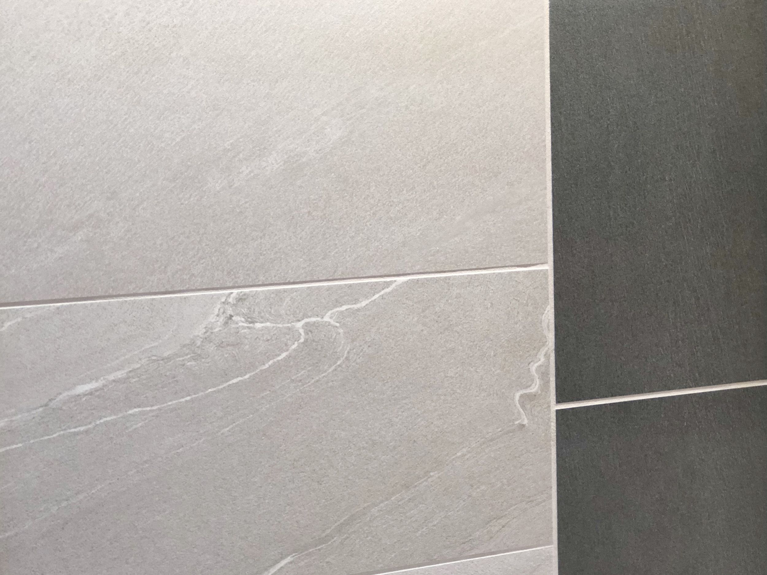
The panel illustrates the balance of warm and cool colors within the collection. The left side of the panel features the color Beige. The two top courses are Leveled Beige, which is the most minimal aesthetic in a natural finish. The movement is very subtle like a basaltine or sandstone. The two middle courses are Stippled Beige, which has a soft white veining that flows through the stone. The surface also has a very subtle stippled or bush-hammered texture to soften the stone’s appearance. The two bottom courses are Rolled Beige, which has a chiseled texture. This texture has light and dark moments giving this phase the most visual interest for both floors and walls.
The right side of the panel features the color Charcoal. All of the courses are Leveled Charcoal, which again is the most minimal aesthetic, but this time is illustrating the honed finish. This finish gives you nice light reflectivity and shine, not as much as a polished, but still enough to contrast against the natural finish and all the while meeting DCOF.
So what grout color did I use? Mapei 39 Ivory I ran this through the joints between the Beige and Charcoal tiles. This is a good example of what not to do. I usually select grout that matches the tile, however, I thought I’d try something different and it was a fail. The color is way too light and you may also notice the joint is way too big. The joint shown is 3/16′, which is way too big for this aesthetic (we ran out of smaller spacers.) The manufacturer recommends 1/16′ joint.
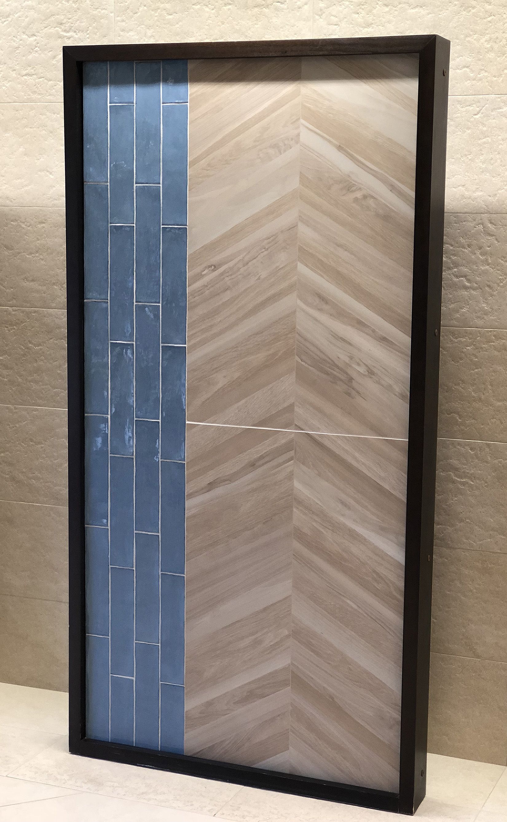
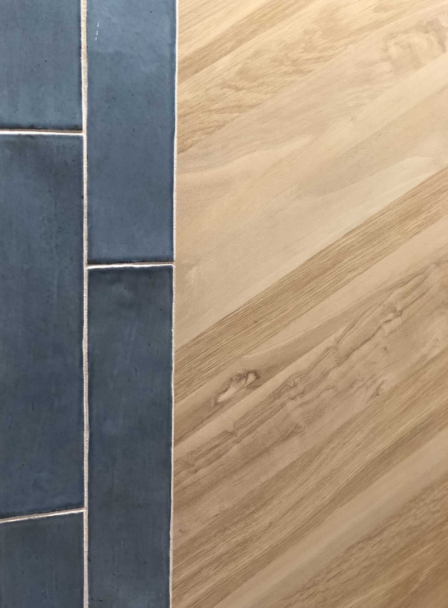
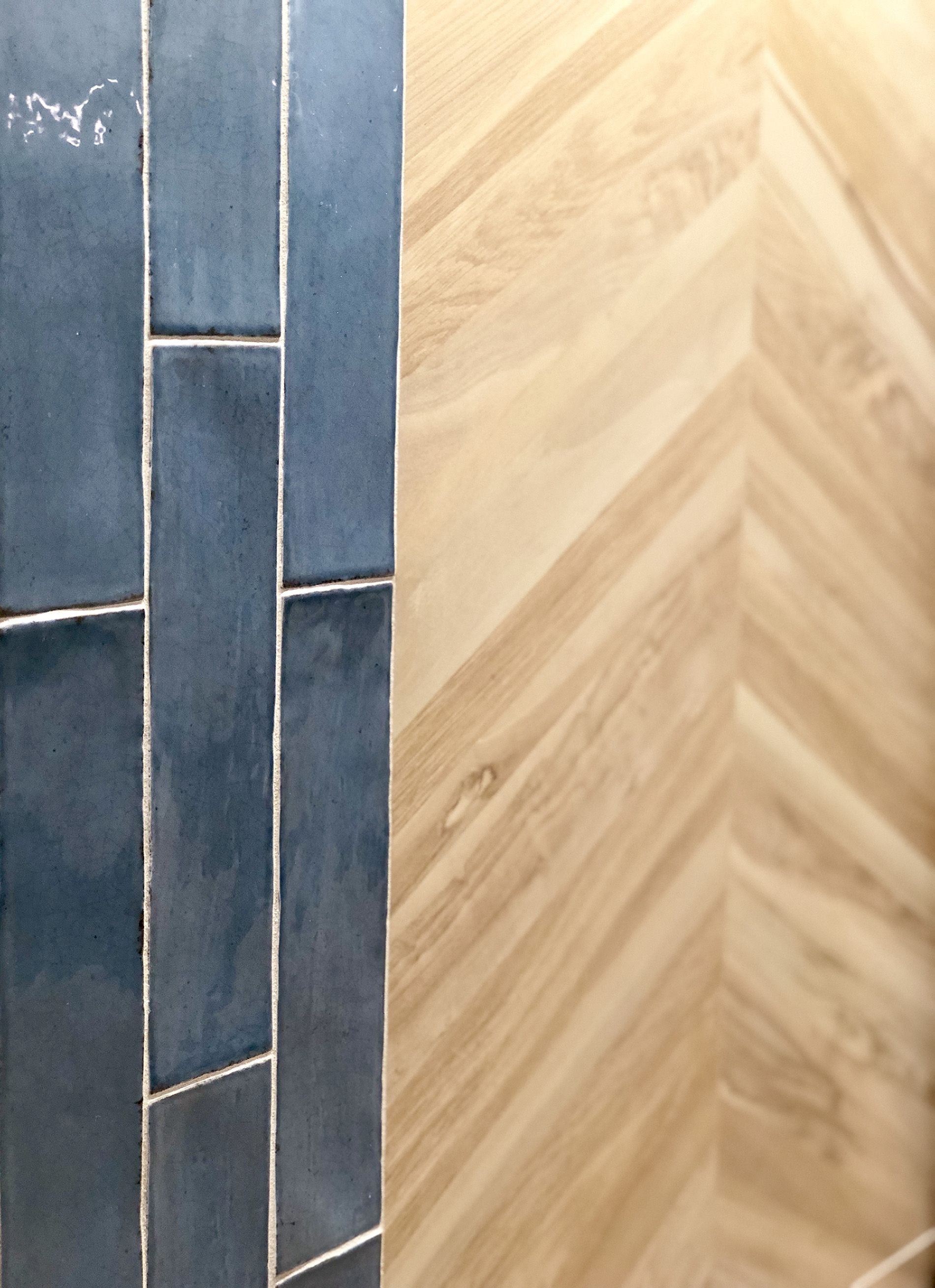
Panel #2 features Enameled and Arden. I really like the balance of the handmade-looking wall tiles with this natural wood aesthetic. The left side of the panel features Enameled Blue Crackle 3’x12′ in vertical orientation with a 1/3 stagger. I like playing with the orientation of the tiles; typically you would see this used in a horizontal orientation for a backsplash or bathroom wall, but I think it also works great vertically especially if you have an area where you want to place emphasis on its height or make it feel taller.
Another great feature of this handmade looking tile is its glossy crackle finish. It’s actually a faux crackle. This crackle has been digitally printed on the tile, so this means general maintenance and installation will be easier because the tile does not have to be sealed before and after grouting, and it has a great budget-friendly price point (contact your Architectural Sales Consultant for more information). The tile is perfect for wet applications because it does not have those hairline fractures in the glaze like a traditional crackle tile, so there’s no risk of water getting into the body of the tile. (When this happens with a traditional crackle tile, the crackle appears darker, which goes away once the water has evaporated from the tile.)
The right side of the panel features Arden Beige Chevron 24’x48′ in natural finish. (It is also available in a polished finish to simulate a high gloss lacquer finish on a real wood floor. Please note the polished tile does not meet DCOF.) I love this wood look porcelain because its walnut and hickory aesthetics are a couple of my favorite real wood aesthetics. (Here are more real woods that I like… Poplar, Birch, Zebrawood, Black Walnut, Olive Wood and pretty much anything with a Burl.)
This chevron design is great for commercial applications because it’s a digital print of a wood chevron pattern on a 24’x48′ tile. This means it’s faster to install than laying individual chevron tiles; it has the look of wood with the durability of porcelain, so it won’t scratch, and real wood flooring that has an oiled finish will require reapplication at some point whereas this porcelain wood look does not.
So what grout color did I use? Mapei 39 Ivory I ran this through the joints between the Enameled Blue Crackle and Beige Chevron. I tend to select gray grout for blue tiles, but decided to change it up this time and I really like the warmer color with the blue. Notice how the grout joint seems irregular, well this is because of the irregular edge that gives this tile a handmade look.
The other reason why I selected Ivory, is if you look closely at the chevron tile there is a small faux seam where the edges abut, the Ivory is pretty close in color. After the panel was grouted, the Ivory didn’t have as much gray as I had hoped for, so my other recommendation for the Beige Chevron is Mapei 103 Cobblestone. It has a nice warm gray color similar to the seam.
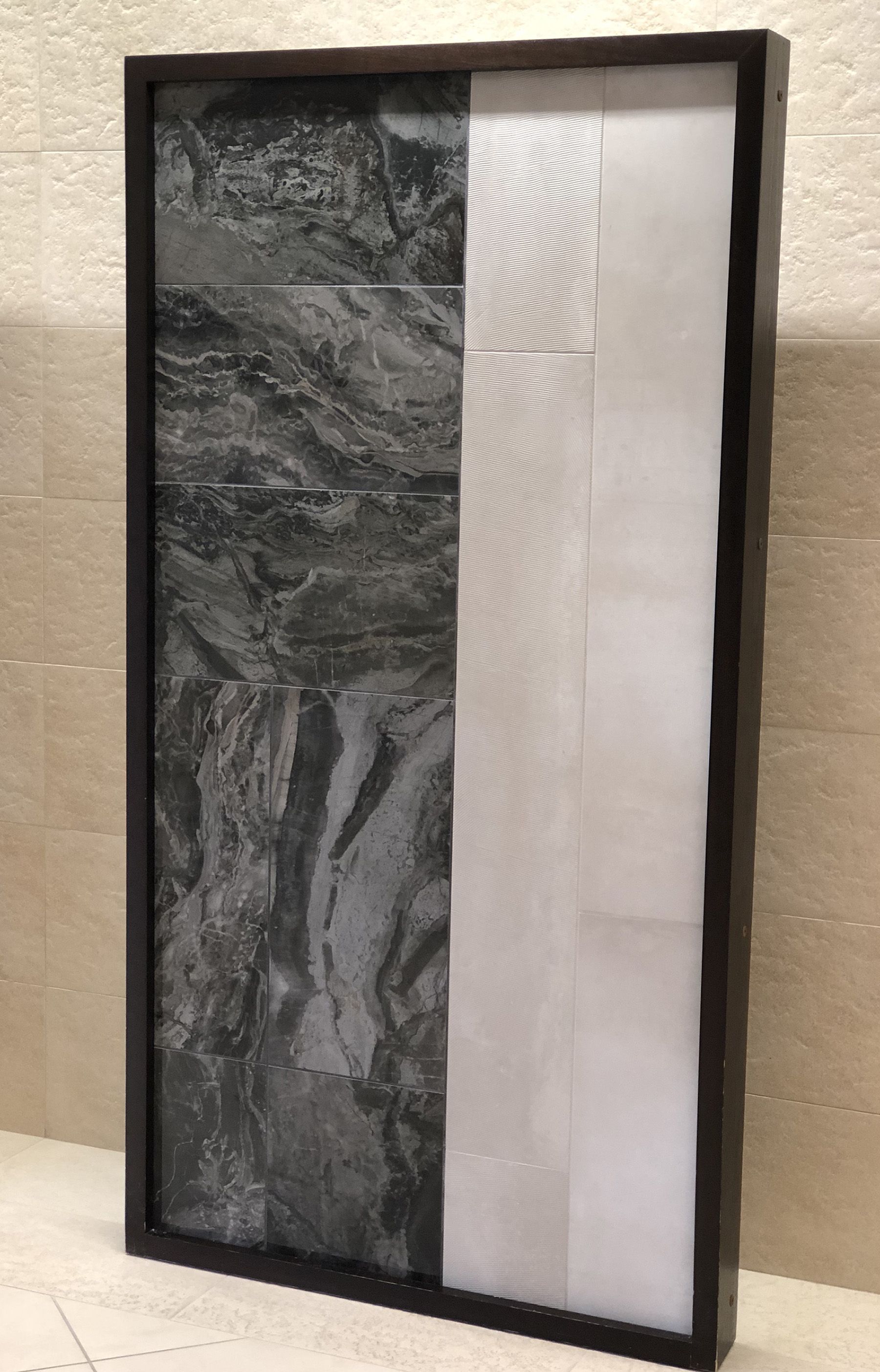
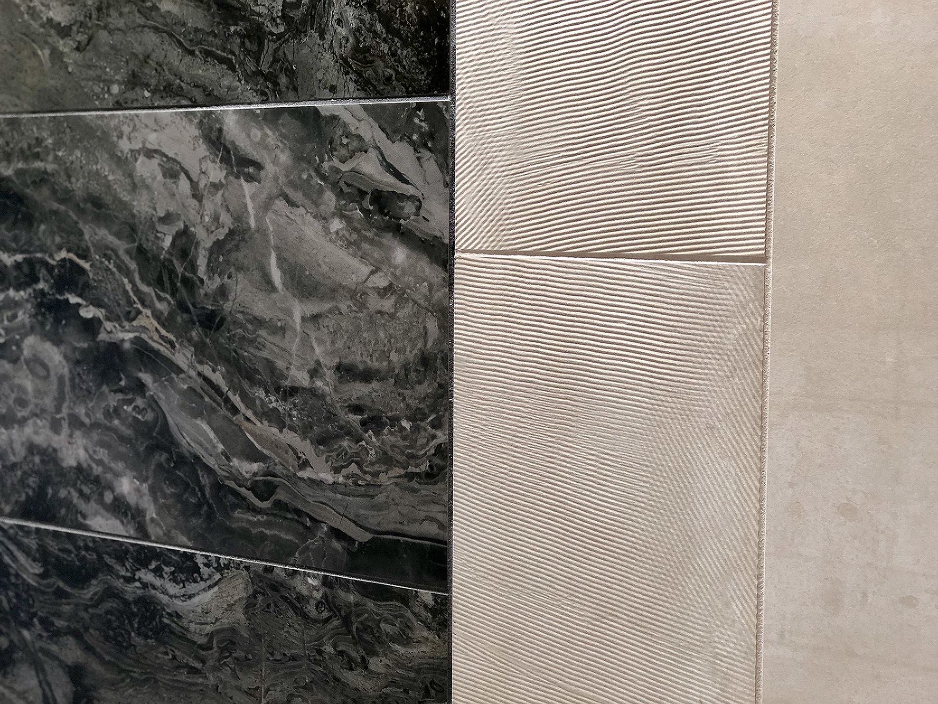
Drumroll, please…I saved the best for last. Panel #3 features Mozzafiato and Metal Effects. I love the balance of the colors and the organic stone aesthetic with a contemporary metal aesthetic. It reminds me of the mix of old and new; old architectural buildings with new interior elements, like furniture or finishes.
The left side of the panel features Mozzafiato Nuvolato Marrone. The three horizontal courses at the top half are Nuvolato Marrone in matte finish. This mimics a honed finish you would find on a natural stone, which softens the veins and the color of the stone, while a polished finish enhances and defines the stone’s veins and color. The two vertical courses at the bottom half are Nuvolato Marrone in a polished finish.
Nuvolato Marrone is my favorite stone aesthetic from Mozzafiato, it draws inspiration from the real stone, Arabescato Orobico Gold of Northern Italy. Natural stones with dramatic flow and veining are my favorite, however since it is coming out of the ground, you never know what you’re going to get. One block might have perfect diagonal movement and beautiful coloring, yet the next one could look nothing like that. If you’re someone who wants consistency and similar range with a stone aesthetic, I would recommend looking at porcelain stone looks. Digital scans are taken of the best stone slabs and printed on porcelain. Admittedly, the technology has definitely come a long way, but it’s still not perfect. If you look at the matte finish up close, you can still see some pixels, the polished finish not so much. Here’s the thing: if you’re using the matte finish on the floor, place the tiles on the floor when you’re looking at them. The pixels won’t be visible and all you will see is a beautiful stone look with a flowing vein.
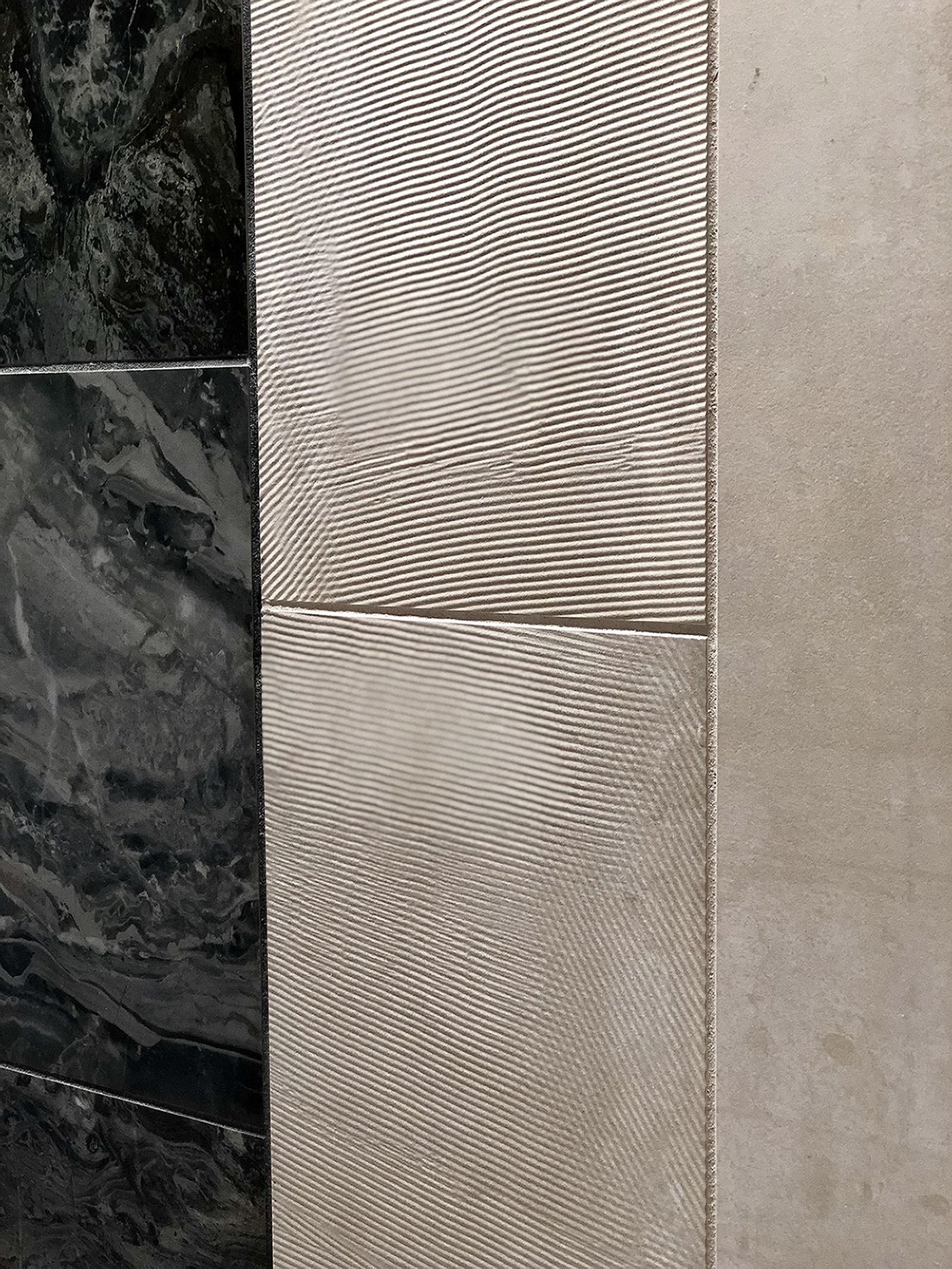
The right side of the panel features Metal Effects Sand. I’m not usually a beige person, but this color has a great mix of beige and silver, I really love it! The first vertical course next to Nuvolato Marrone is Sand Raked. I love this texture, it’s not something you would find as a typical metal finish. It reminds me of troweled plaster, but finer and smaller in scale and the movement is random with horizontal and diagonal moments. It’s a great texture to use if you want to break up moments of the Sand in natural finish that is the outer vertical course.
One more feature I’d like to point out about Mozzafiato and Metal Effects: they both have 6mm Gauged Panels. Mozzafiato’s gauged format 63’x126′ mimics the size of natural stone slabs, giving you that look and grandeur of stone panels on a wall. Metal Effects’ gauged formats are also mimicking large sheets of metal, giving you the look of metal panel walls or allowing you to create a metal-clad fireplace.
So what grout color did I use? Mapei 10 Black for Mozzafiato Nuvolato Marrone and Mapei 39 Ivory for Metal Effect Sand and Sand Raked. My other recommendation for Nuvolato Marrone is Mapei 09 Gray, if you want to pick up some of the lighter gray moments in the stone. For Sand and Sand Rake, I would also recommend Mapei 01 Alabaster which has a gray undertone to it picking up the silver within the Sand color.
Our Architectural Sales Consultants are scheduling times to show the 2018 Fall Winter Collection now, so feel free to contact them to get something on the calendar. If you don’t know who your consultant is, contact us here, and we’ll connect you.