
 About three weeks ago, I was getting my fill of Chik-Fil-A, pimento cheese, fried green tomatoes and tile, of course! Coverings was held in Atlanta, Georgia this year. If you’re not familiar with Coverings, this show rotates around different cities in the US. It is where US manufacturers feature their new products, and it is where Creative Materials selects their Fall Winter Collection. You may recall my blog on Cersaie in October. That show is held in Bologna, Italy and features new European products, which we select for our Spring Summer Collection. We’ve done the math, it’s about 5 miles (of walking and viewing tile) x 3 days = a whole lotta tile and we do it because our ultimate goal is to provide you, Interior Designers and Architects, with the most current (and hopefully coolest) tile aesthetics and designs.
This month will feature several looks that we saw at Coverings, which we envision as being future tile trends within the design industry in 2018 and beyond, and just maybe, you will see some of these looks in our 2018 Fall Winter Collection, but I’m going to keep you in suspense for a little while longer.
(Just a note, some of the products that you see below are new at Coverings and usually take a couple months to be produced.)
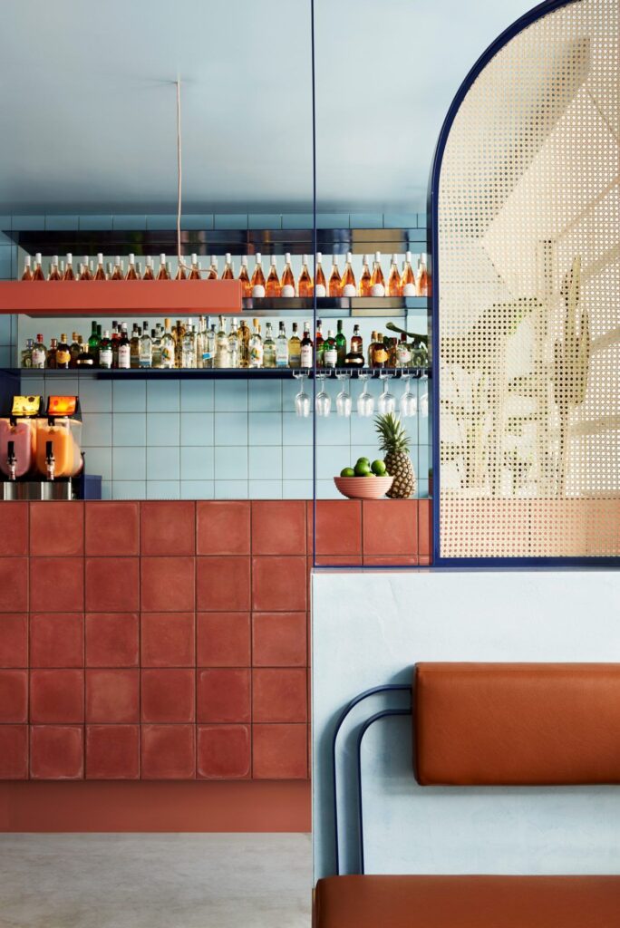
I was pumped to see this color palette at the show! We’ve definitely seen a return of bold, bright colors at previous shows, which is great because one can only look at gray for so long… don’t get me wrong, I love all things black, white and gray (I wear it on a daily basis), but sometimes I need that ‘Oh wow’/punch of color moment.
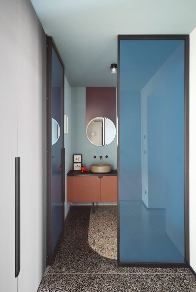
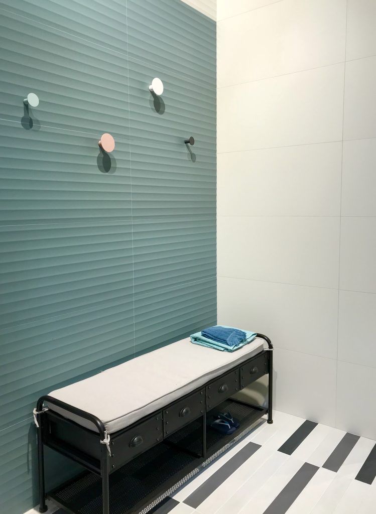
I see interior color palettes shifting to this muted palette; I’ve been seeing European designs on Pinterest and Instagram with muted palettes, an emphasis of curved forms and oblong ovals, and high contrasting black fixtures, frames and borders.
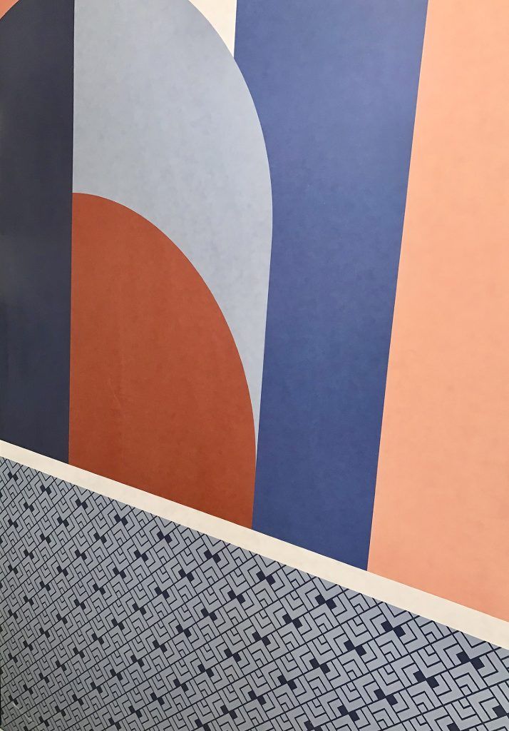
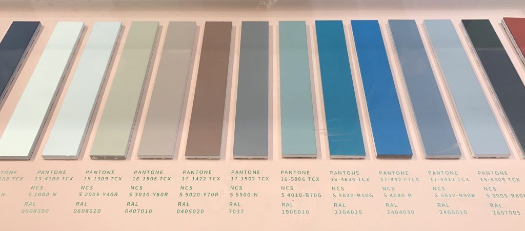
This collection is hands down one of my favorites! These large format tiles look like a high-end wallcovering with the durability of tile. The designs within this collection can be customized with a great muted color palette shown below. The collection features an interesting range of geometric and organic designs, but the ‘Deco’ design below is my favorite and illustrates some of the looks I’ve seen on Pinterest.
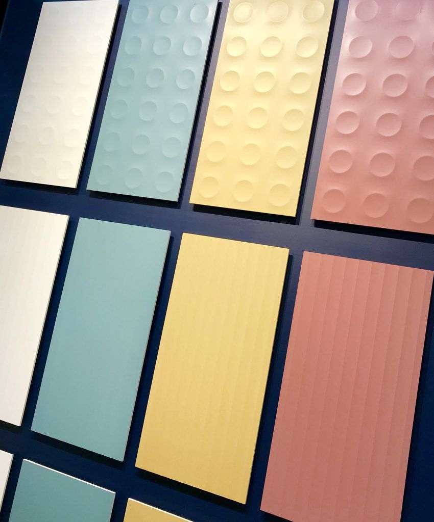
You may recall our Multidimensional collection, whose 2 tone color palette features dimensional geometry. This collection builds on that same aesthetic with a playful color palette that draws inspiration from 1970’s colors and shapes. The concave circles and lines have a great sculptural quality, perfect for feature walls. The collection also has coordinating flat tiles to balance the circles and lines, as well as a larger scale penny round available in all colors.
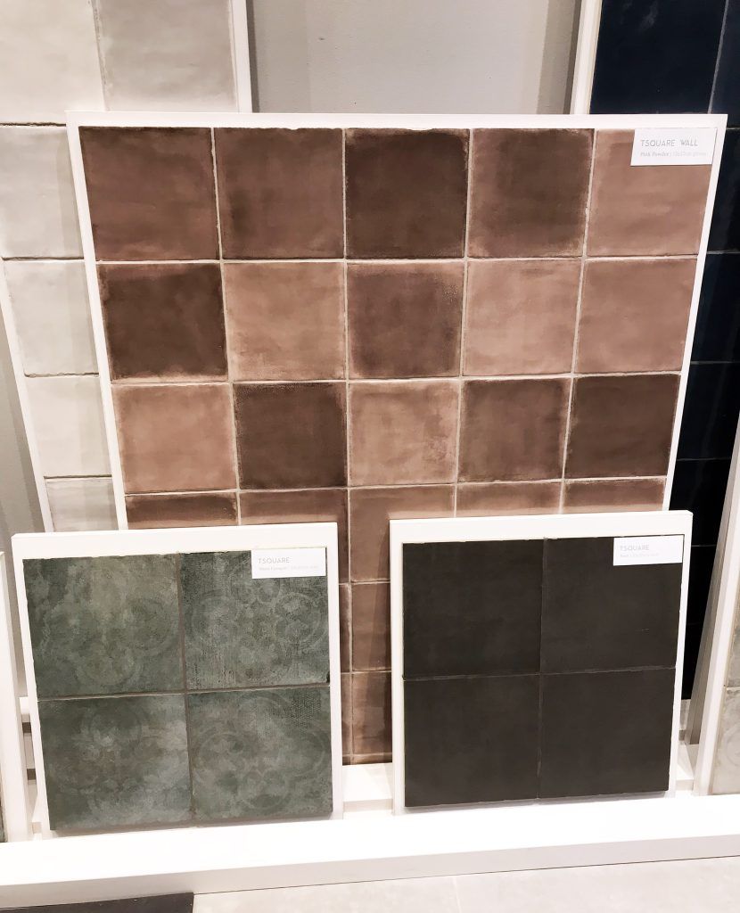
This collection features a beautiful palette of muted colors ranging from powdery pink to mint to thyme green; rounding out the collection are soft and bold neutrals. The glaze on these tiles illustrates a watercolor effect adding drama to the palette. But wait there’s more, the floor tiles feature soft patterns over mottled grays, moss green and black and facet-like mosaics in colors to complement both the floor and wall tiles.
Marble will always have a presence at these shows; at Cersaie 2017, it was who had the best graphic for their Calacatta/Statuario, etc.; at Coverings, they are replicating marbles that have a ridiculous price tag or have been over quarried to the point of extinction. Don’t get me wrong, I love the beauty and uniqueness of real marbles, but they do carry a high price tag and I found that there are two types of people out there: those that understand natural stone is just that, natural and there is no controlling its characteristics (coloring, veining, etc.) and there are those that want to know what it’s going to look like and that it’s not going to vary from the first image they see of it. For the latter, I would hands down recommend a porcelain marble look. They will get what they see in the sample and installation images.
This Renoir will create a bold statement for your design, it’s gorgeous and not for the faint of heart. It’s contemporary takes on terrazzo with it bars and blocks motifs are another cool feature of this collection.
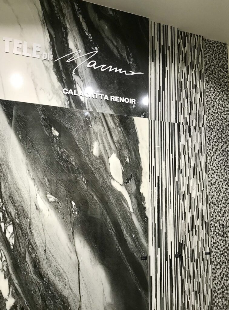
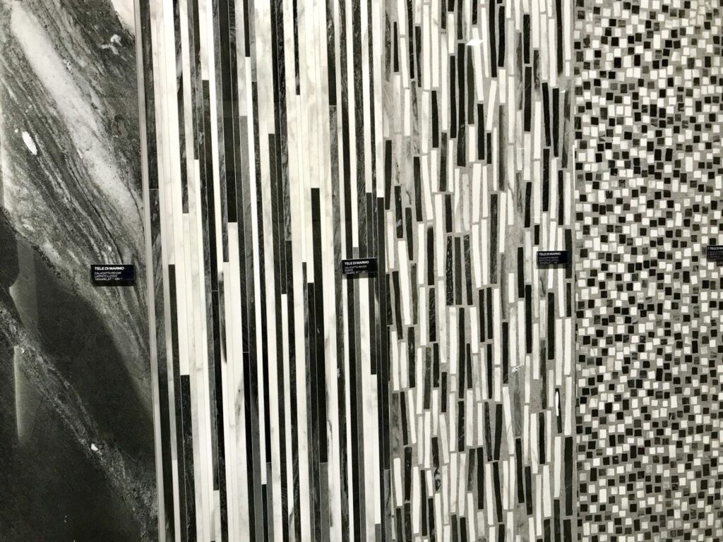
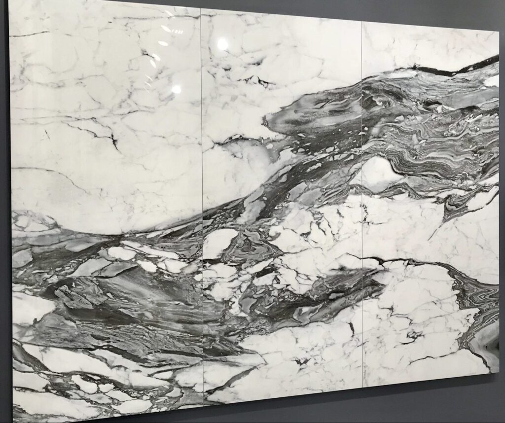
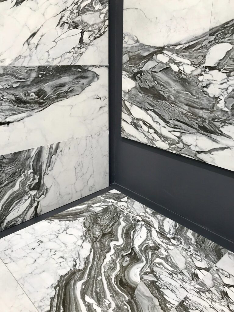
If the previous Renoir is intimidating, then this one is for you. The veining is a little quieter and there is more balance between the black and white.
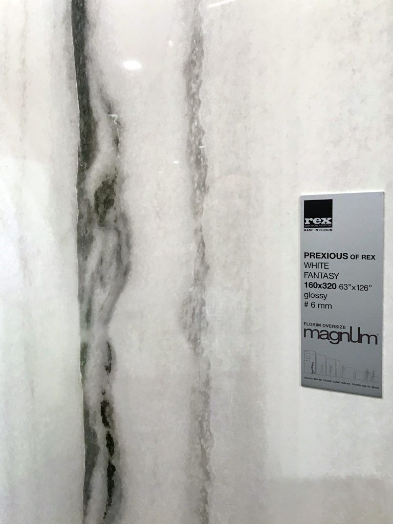
Keeping in theme with black and white marbles, but something on the opposite spectrum of Renoir is White Fantasy. It is a minimalist, yet bolder version of Zebrino marble, it creates excitement with bold vertical black and gray veins.
![]()
Wood looks have gone through quite a few phases, there was the emergence of wood looking tile (all the rage), there was the “let’s mimic every type of reclaimed wood possible”, every shade of gray woods, now we’re seeing charred woods and blue woods emerge at the shows, but the aesthetic I enjoy seeing now in wood, is wood in its natural form… white oak, walnut, hickory that mimic their look with a waxed or smoked finish or a clear coat of poly.
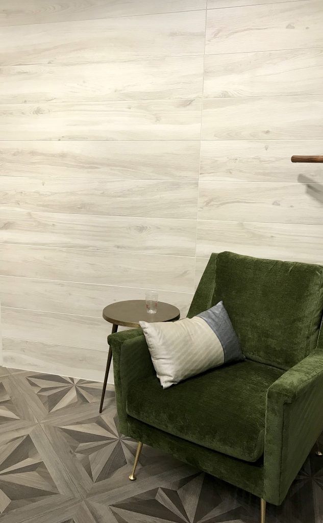
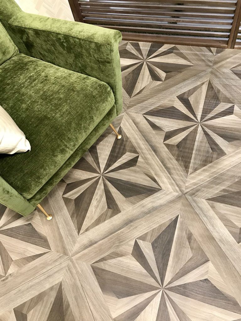
A great domestic option for a natural wood aesthetic. The honey color (shown within the Star Decor) leans more towards a smoked white oak.
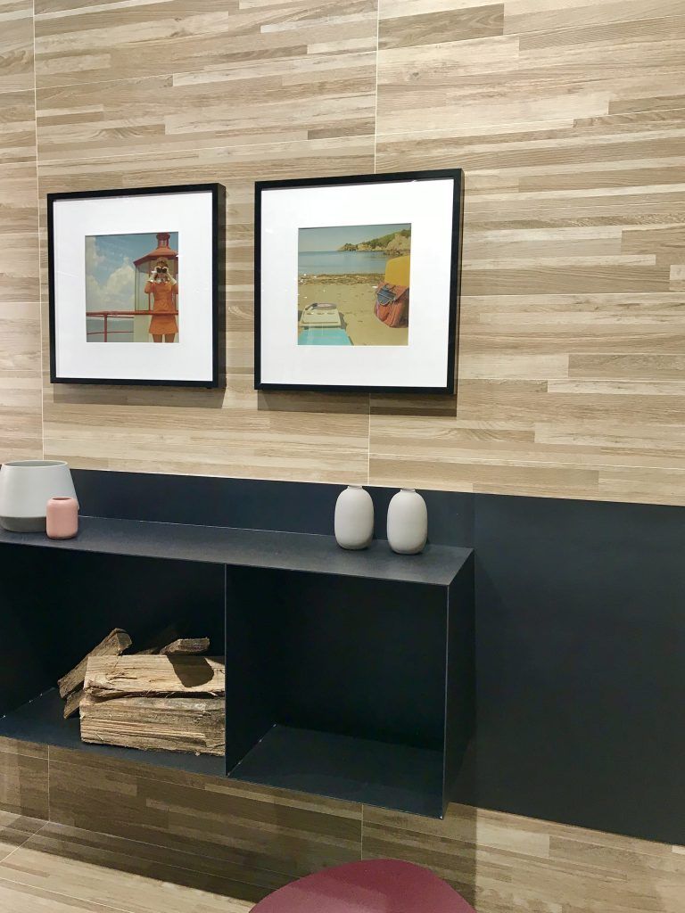
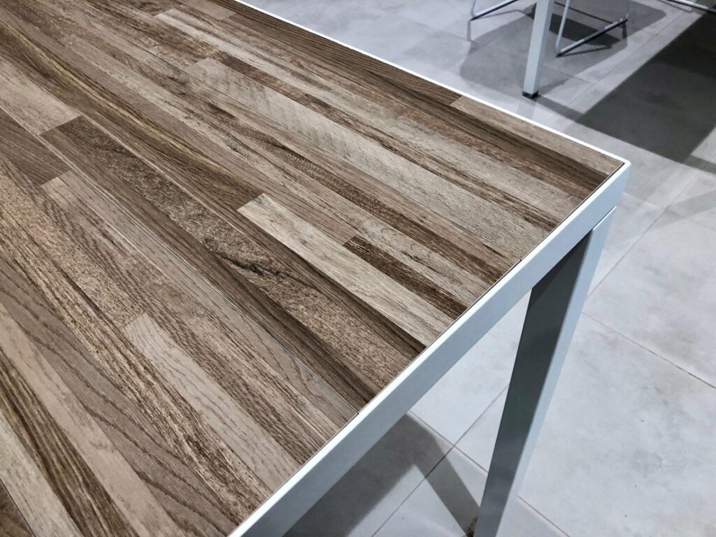
This aesthetic mimics the look of reclaimed wood strips, which I can see working in certain applications (restaurants), but at Landmark’s Coverings booth (and their TN showroom) they built metal frame tables and butt jointed the Voyage planks within the frame, and you know what?! I love it because it reminds me of a butcher block table top and unlike real butcher block, you don’t have to oil or sand out scratches. It’s also great for exterior table top applications where real wood won’t hold up against the sun, rain and snow.
Thank you for checking out the great tile looks we saw at Coverings 2018. Stay tuned for Part Two of this series featured in June where I will discuss a couple more top looks from Coverings. Until next time…