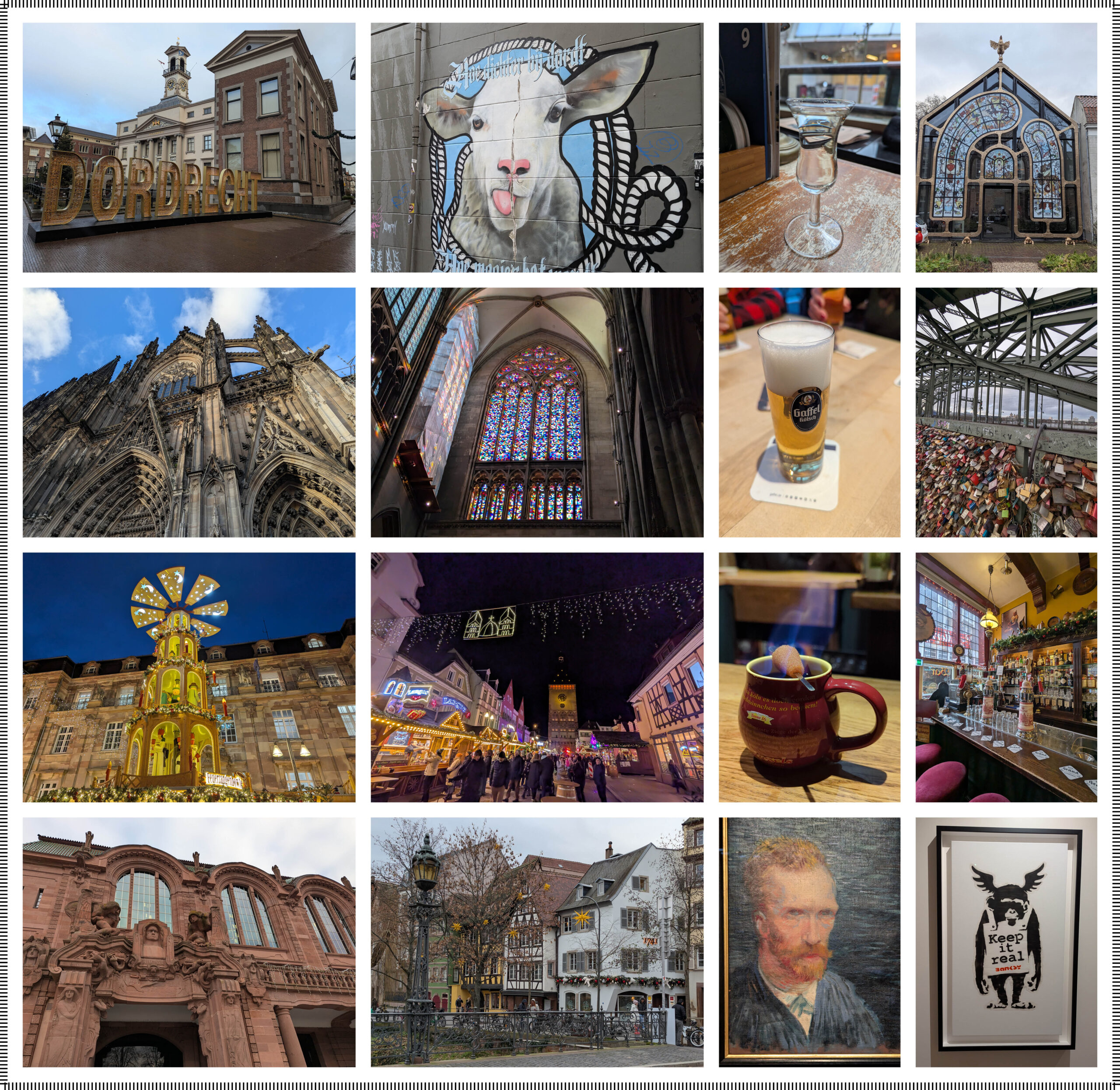
Hello design friends! I’m sorry it has been a while! The end of 2024 and the beginning of 2025 were a whirlwind personally and professionally. I went on a Christmas Markets Viking River Cruise on the Rhine in December, with my mom, cousin, and aunt. I wasn’t crazy about cruise ships after having 30-foot seas when we went to Bermuda. I had vertigo and sea legs for a week afterwards, it was not great! But Viking was nothing like the massive ocean boats. There were a lot less people and it felt like you were on your own personal floating hotel. The staff was fantastic! I miss my bartender besties and hope to see them again on another cruise! The sites and food were incredible! I managed to get all 11 of my gluhwein mugs home in one piece! Here are some pictures from the Netherlands & Germany…
On to professional stuff… Design Services has been quite busy creating mood boards, pattern layouts, and installation guides! I’m sending a huge thank you to all of you who have used the service and continue to use it! We really appreciate it! If there is anything you would like us to add to our offerings or if you have any feedback, we would love to hear from you! You can reach us here: [email protected].
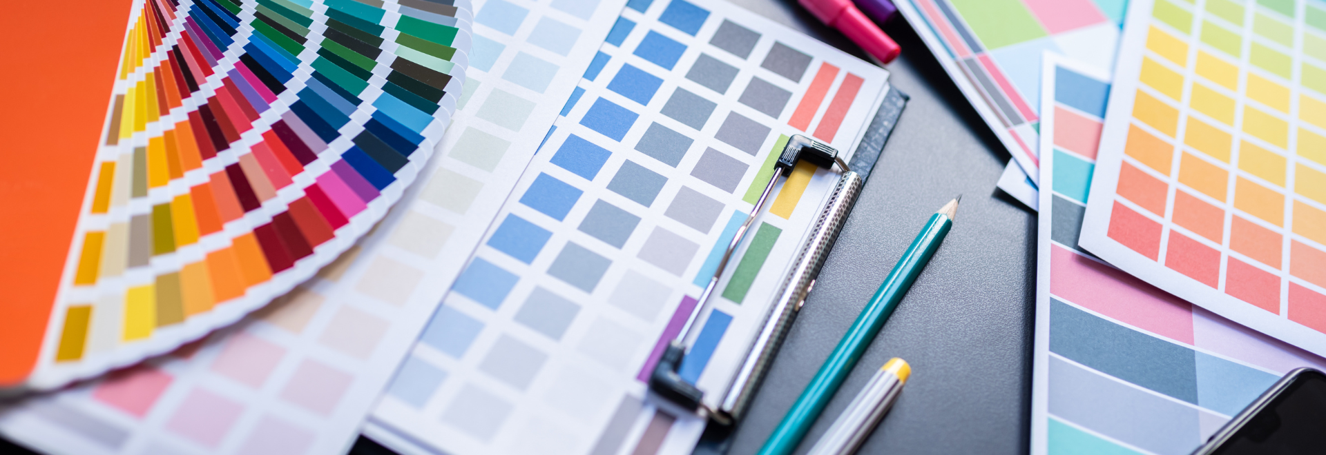
As you may have noticed, it has been a little while since my last blog. That’s because we shifted the release of this year’s blog to coincide with the launch of the new collections from Creative Curations by Erin.
Let’s take a look at this season’s (4) New Creative Curations by Erin Collections: Tessellate, Chromatic Flows, Colorform Shapes, and Mindful Harmony!
When I see this collection name, this line from the song Tessellate by Alt-J starts playing in my head… “Triangles are my favorite shape, three points where two lines meet, toe to toe, back to back, let’s go, My love, it’s very late, ‘Til morning comes, Let’s tessellate.” I’ve read several thoughts about the meaning of those lyrics, and they are all very interesting! What do you think it means?
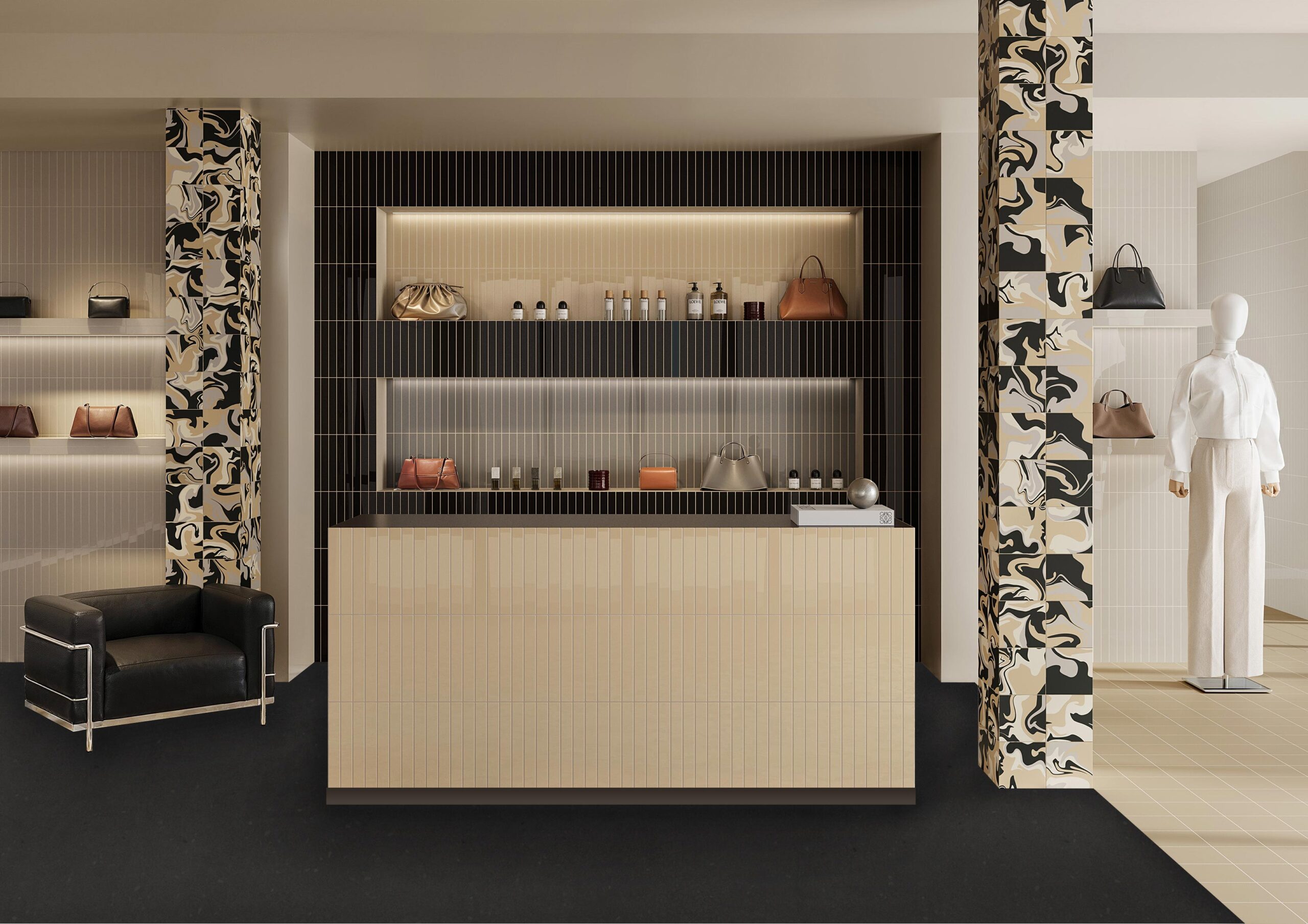
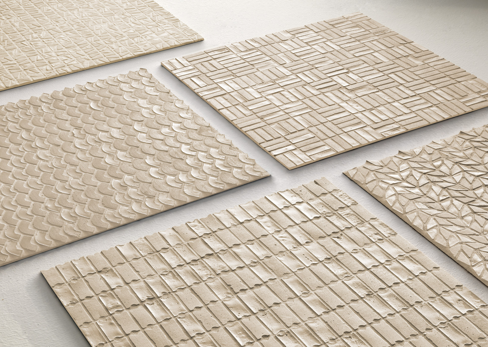
Now that I’ve got that song in your head, let’s talk about Tessellate the collection. Let’s talk about why I’m so obsessed with Tessellate…
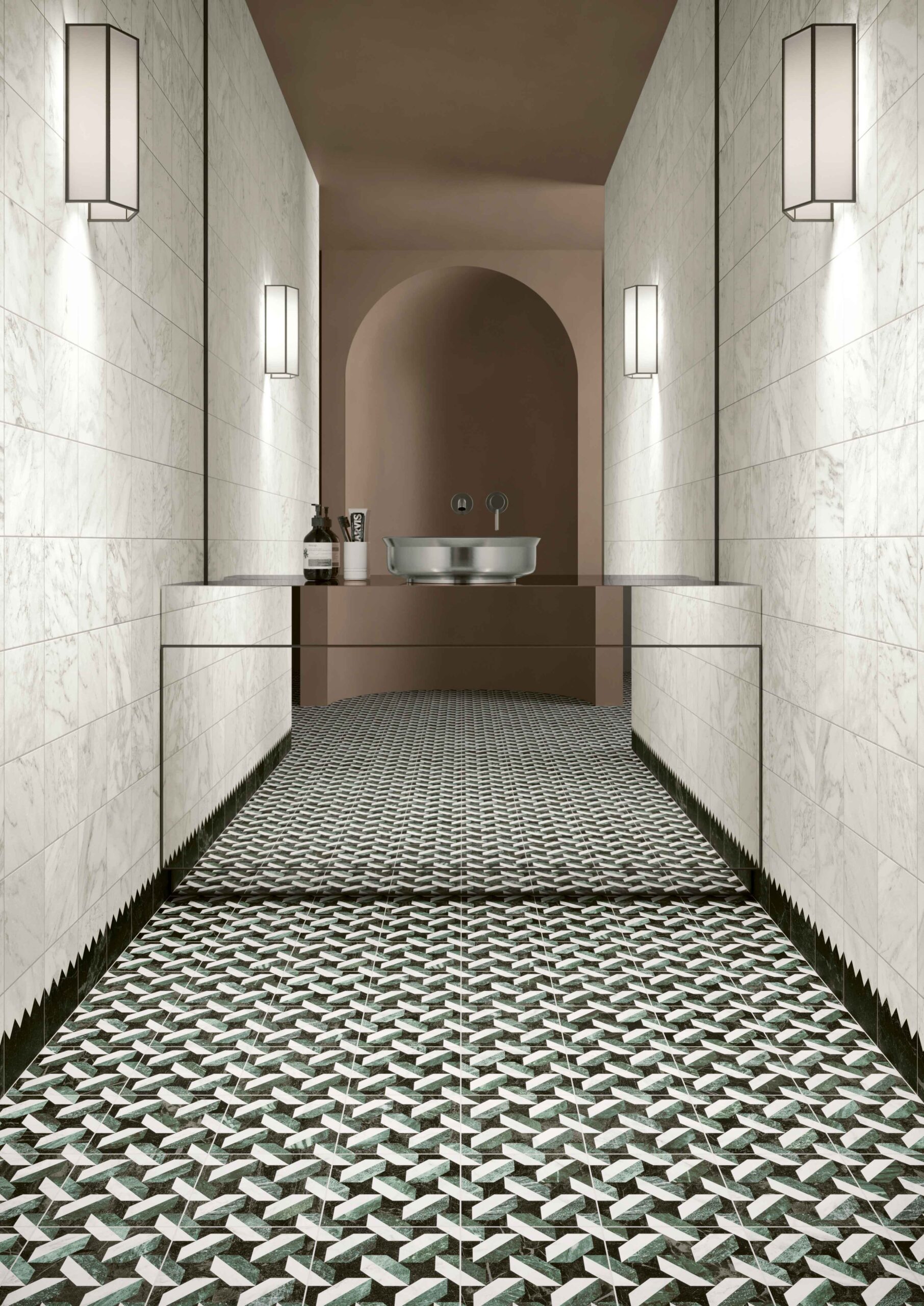
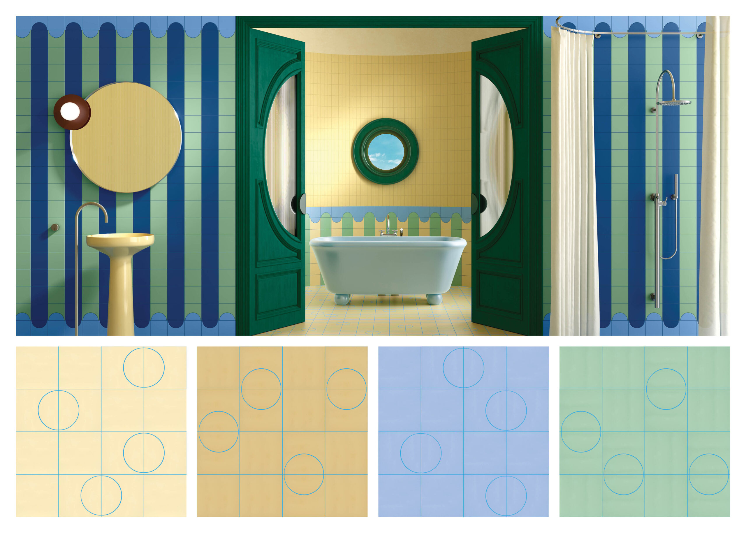
Zipper isn’t the only pattern that could be used as a wall base. Here are a couple other patterns that could be used as unique wall base options. Which patterned tile from Tessellate is your favorite?
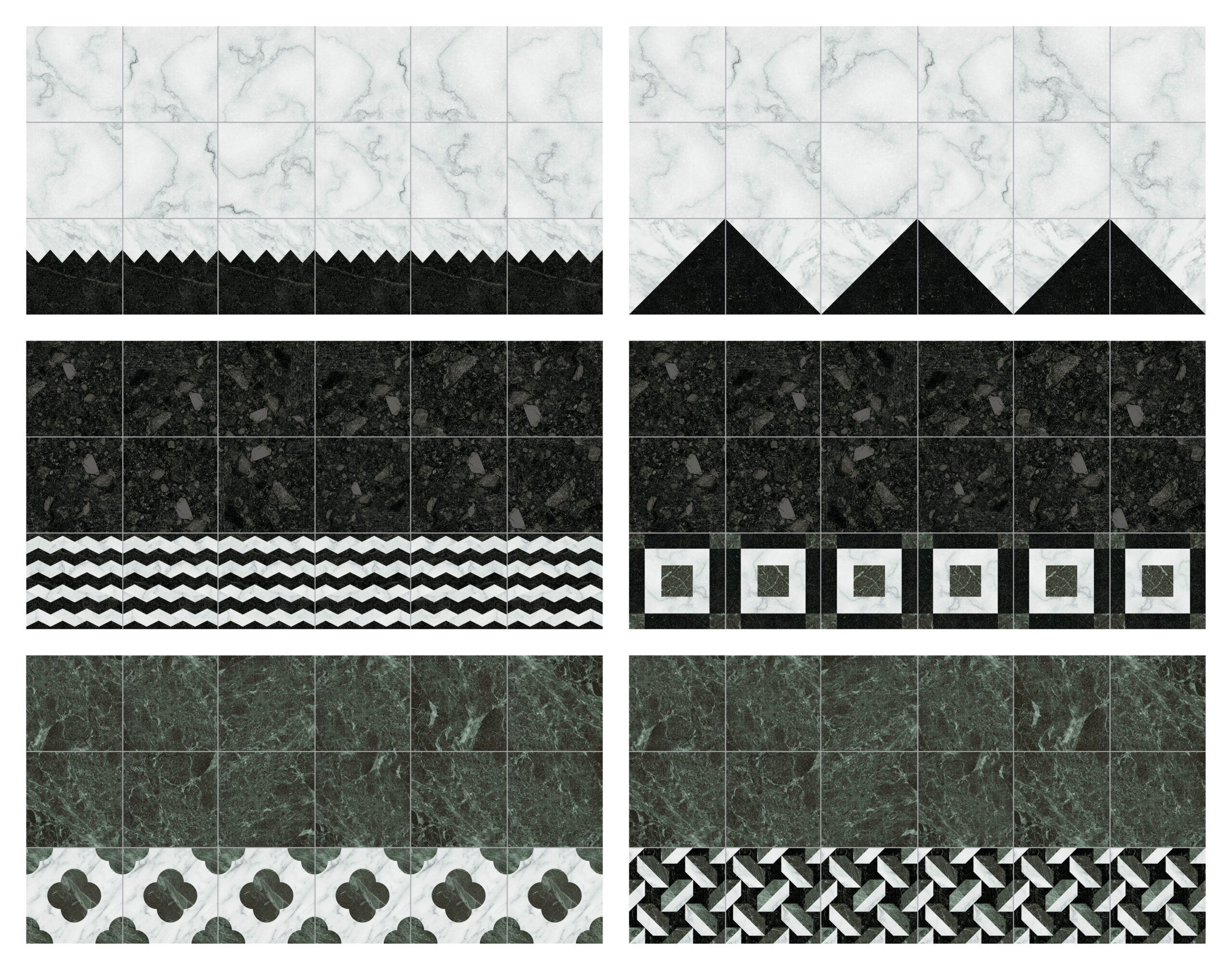
Use Tessellate next time you want to use a patterned mosaic, but don’t have the budget for a mosaic OR when you want to play with a medley of patterns and put a unique spin on your design!
Remember in art class when you were working with watercolors and needed to clean your brush when changing colors? Well, Chromatic Flows reminds me of that moment when you dip your brush in the water and the previous color in the cup starts swirling and mixing with the newly introduced color. Unfortunately, the water doesn’t stay pretty forever, but never fear, that’s what Chromatic Flows is here for. This tile is a permanent reminder of that moment in time.
When I’ve been showing this collection to designers, a number have mentioned how cool it would be to use this tile in an ice cream shop. So, pretty please, please use Chromatic Flows next time you work on an ice cream shop! (Extra bonus points if it’s a place with pup ice cream! And near me so I can bring the goldens with me!)
How would you use Chromatic Flows in your project? Would you go bold or use the more neutral colors?
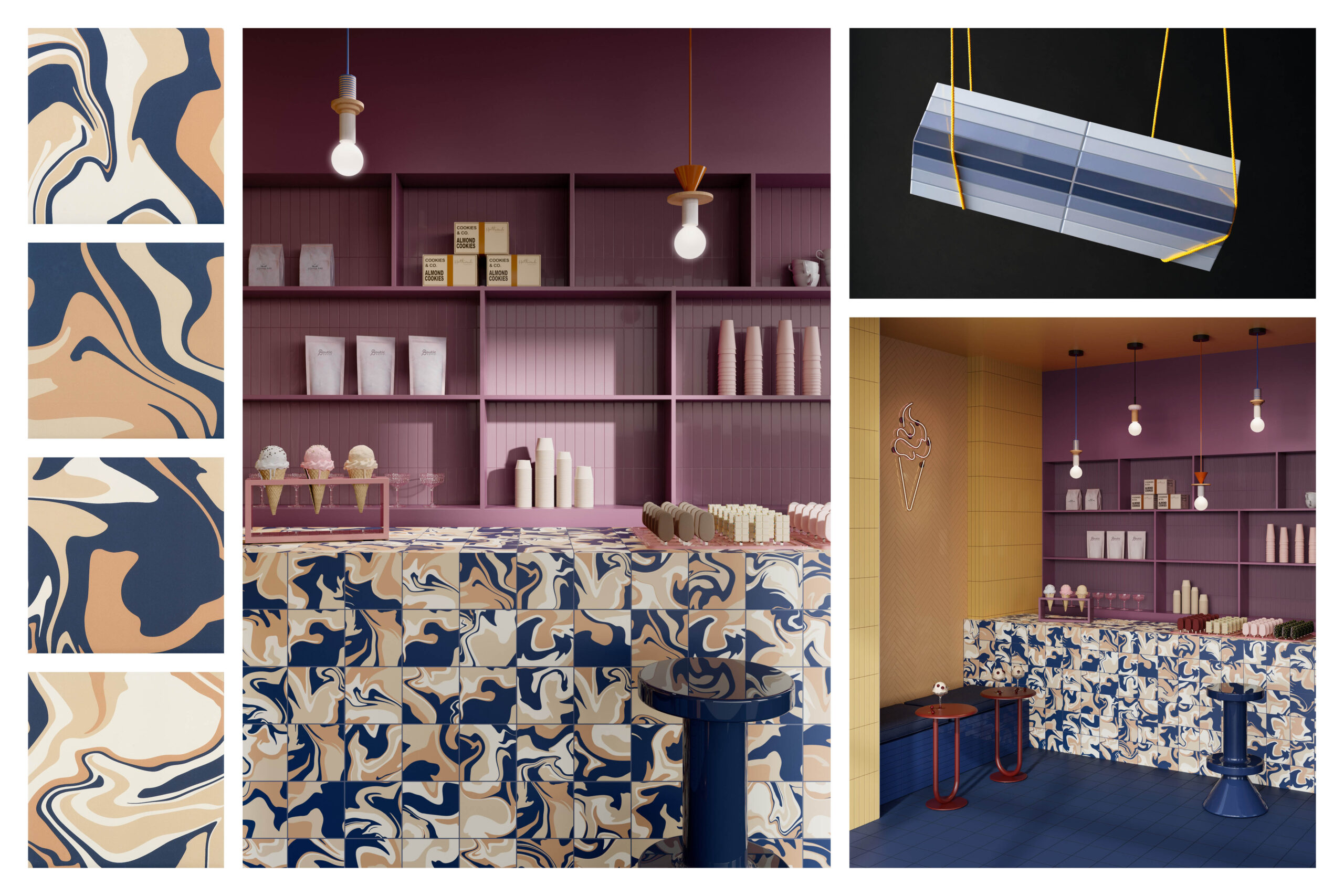
*PLEASE NOTE: Chromatic Flows Color Mixes can only be used on the walls of commercial spaces due to their low PEI.
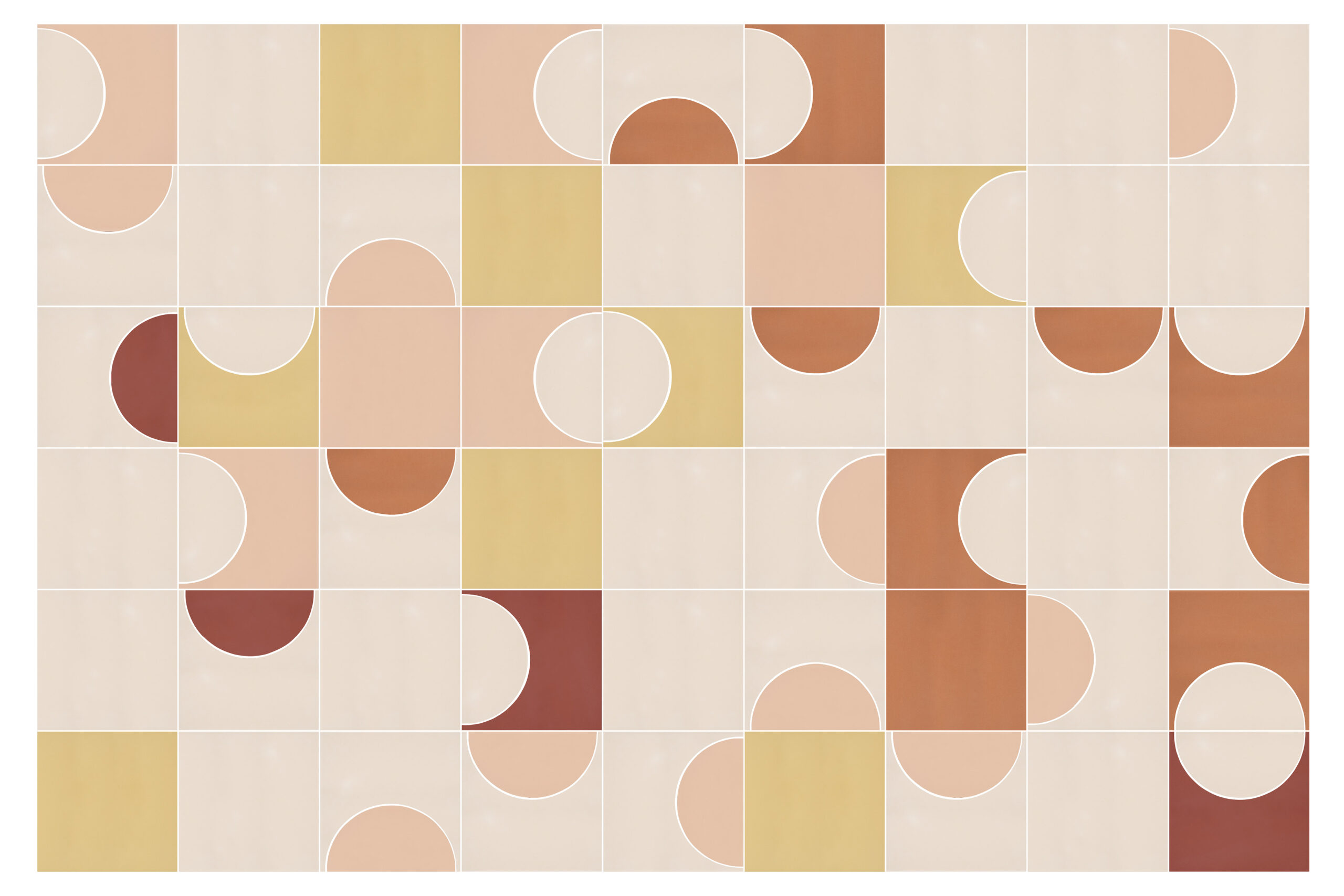
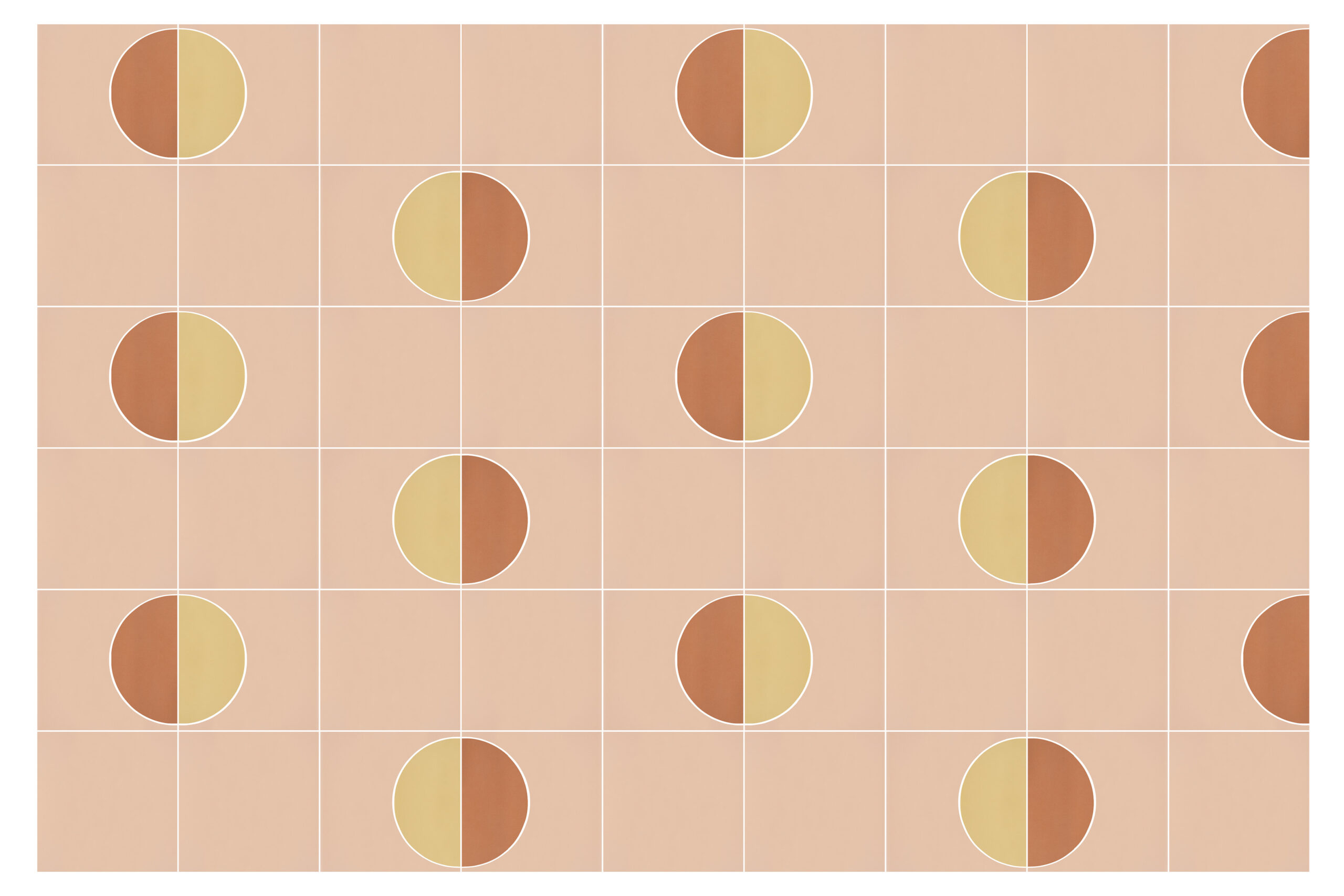
Colorform Shapes is the next evolution of our Colorform collection. Shapes incorporate a 6″ square format along with a semicircle and an outline to encompass the semicircle shape. This allows you to play with positive and negative space on a variety of levels. The geometric elements of Colorform Shapes definitely nod towards graphic design of the Bauhaus era, which also influenced mid-Century Modern design in the United States.
My colleague Sabrina created some awesome patterns below, showcasing a sunset-inspired color palette in a random pattern and a repetitive pattern. To me, the random pattern is more reflective of mid-Century Modern, while the repetitive pattern is more formal and focused on a set geometric design.
When I’ve been out talking about Colorform Shapes with designers, the other detail I discuss is grout colors because this is another way to elevate your design by using a playful grout color. I love this installation image below because of the different designs created with Colorform Shapes – the wall have this very bold, circus like motif on the walls, while the floor has a much subtler design of tone on tone 6″ square, semicircle and outline, but instead of just using a grey grout they choose to use a blue grout to tie the floor design in with the colors on the wall.
*PLEASE NOTE: Colorform Shapes can only be used on the walls of commercial spaces due to their low PEI.*
This is another great example of using grout as art. Grout isn’t just that “thing” that has to be placed between tiles; it can and should be treated like another design element within a tile pattern. I spoke about The Art of Grout in a blog last year, and I plan on writing another blog on it this year, and the continuing evolution of grout.
What do you think of this new approach to grout as a design element and not just a “thing” in between tile?
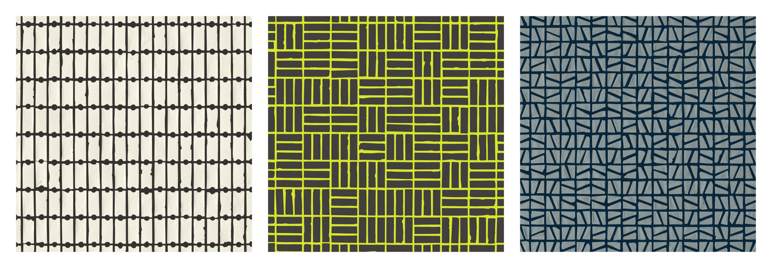
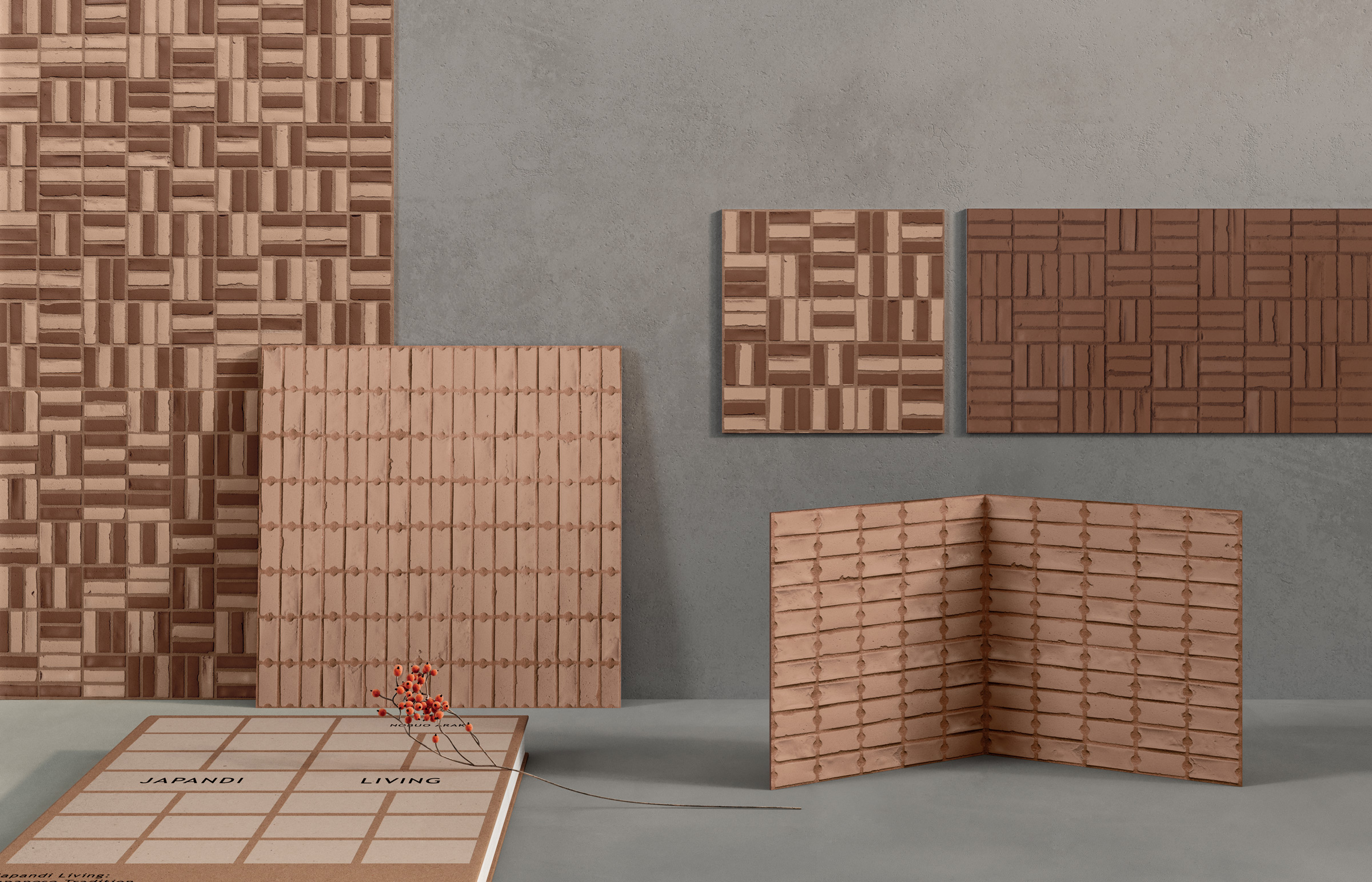
Mindful Harmony is a micro mosaic with a beautiful, handcrafted appearance. It reminds me of working with clay, and when you cut through a block, you get this natural, irregular surface that is transformed by the grit of the clay or the air bubbles that create a divot in the surface. Mindful Harmony has bits of this in the small shapes that create this mosaic. These details can be soften by a tone on tone grout as seen in the image below, or it can be accentuated with a contrasting grout like the (3) images at the bottom – White Dot Dash with a standard black grout, Black Sticks with a custom highlighter yellow grout, and Blue Slope with a custom navy blue grout.
The tone-on-tone grout creates a monolithic effect with the mosaic, while the contrasting grouts emphasize the individual pieces and shapes created by the negative space of the mosaic.
Which grout concept do you prefer with Mindful Harmony – tone on tone grout or contrasting grout?
Let us know if you would like to see other grout colors used with Mindful Harmony. Design Services can mock up some examples.
If you would like to learn more about these collections and our other great offerings from Creative Core & Contract, please contact your local A&D Consultant and they can schedule an appointment to discuss these great collections.
Until next time…
E
Follow me on IG @creativecurations_erin