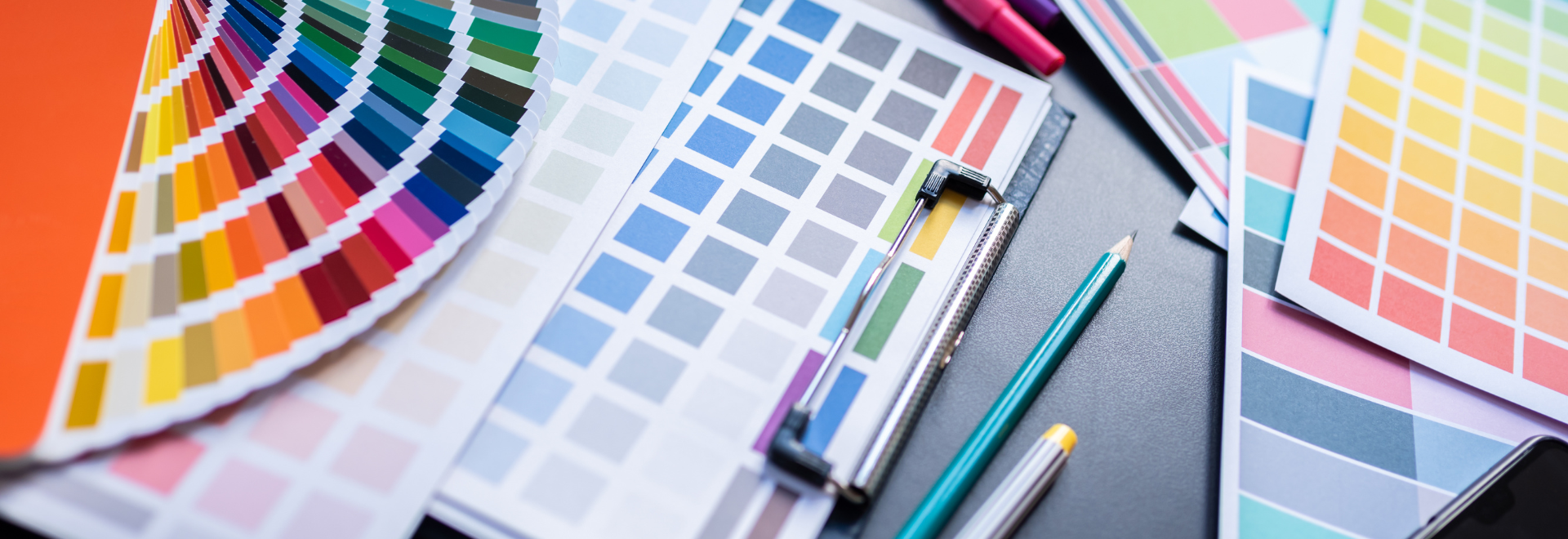
In early April, the Creative Materials team attended Coverings, which is the largest tradeshow in North America for ceramic tile and natural stone. This show is where North American tile manufacturers showcase their latest collections and trends.
In the days prior to the tradeshow, Coverings hosts a number of seminars diving into the trends and aesthetics that will be shown. This year the trends were quite extensive with ten aesthetics ranging from Baroque to Crisp & Clean to Polarized Marble, just to name a few. (Click here to read more about the other trends covered in the “Top 10 Tile Trends of 2022.”)
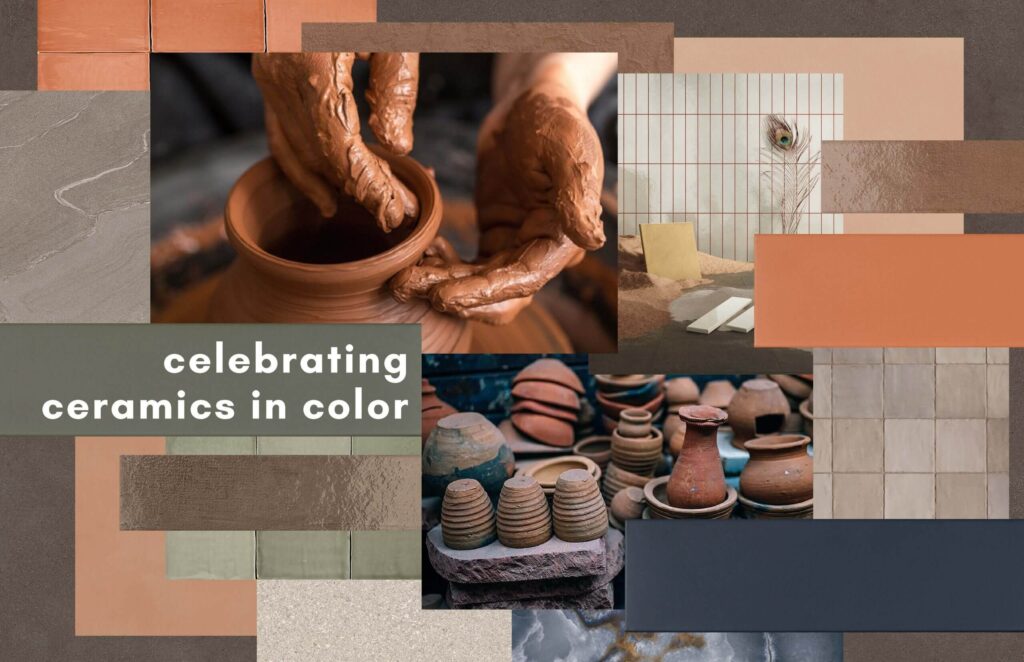
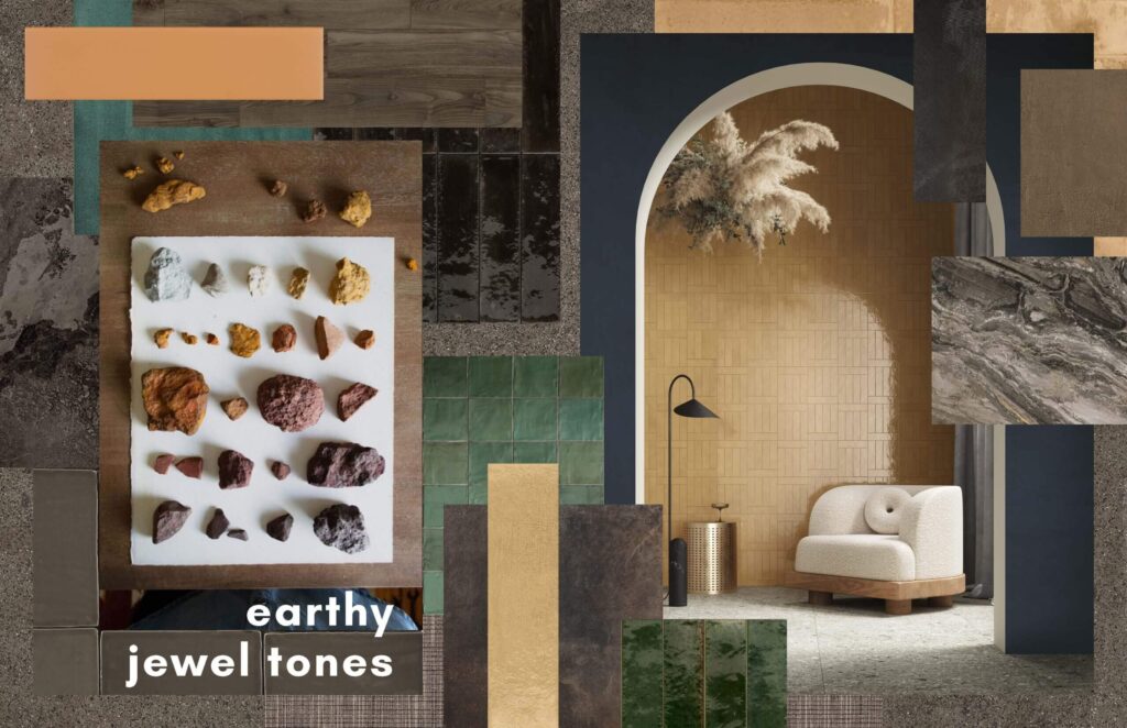
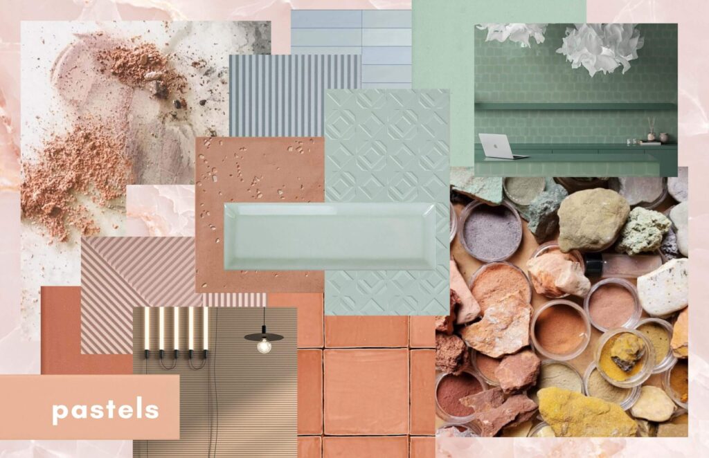
The tile trend that caught my eye is the Captivating Colors, which focuses around three color palettes: Celebrating Ceramics in Color, Earthy Jewel Tones, and Pastels.
If you’re thinking, why this one? It’s because I’ve always been drawn to color above any other characteristic or aesthetic. I’d like to think color is my interior designer superpower; I just have an eye for it and can see the very subtle nuances within colors. (Which is kind of funny because those of you that know me and have actually put my glasses on, know I’m blind as a bat without them.)
Having been in the tile industry for the last six years, I’ve enjoyed seeing the evolution color has taken from bright, primary colors shifting to muted and saturated tones to spotlighting colors like blues and greens to more broad-based palettes focusing on natural pigments.
I’m really loving these more recent palettes because the pigments focus on natural elements like minerals, plants, and insects. (I bet you didn’t think crushed bug guts could create beautiful dyes and pigments, but they can.) I find this nod to colors in their purest form to be the most beautiful and timeless color for interiors.
Let’s take a look at how these three color palettes were described during the seminar by Alena Capra, owner of Alena Capra Designs and Coverings spokesperson…
“The industry is circling back to some intriguing classics from centuries past. These are ceramics that are not trying to mimic anything, instead honoring the rich and artisanal history of this material and industry such as weathered edges, classic glaze techniques and traditional patterns. This celebration of ceramic roots plays beautifully with preceding trends and is often seen in soft color tones like greens with twilight undertones, peachy- and chestnut-brown terra cotta hues, creamy tans, sandy beiges, and even Santorini Blue.”
“Because of the pandemic quarantine, the world is ready to invite more natural colors into the home and onto the walls. Jewel tones that can be found in nature, including amber, brick, emerald, and aquamarine hues, are popular palettes for tile in 2022. Leafy greens and rich clay colors give us a grounded connection to the outdoors.”
“Dovetailing with a ubiquitous feeling of romanticism, ceramic manufacturers are incorporating pastel colors like sage, mint, rose, and sky blue to their collections, which add a soothing and organic effect to interiors. These hues also fit into larger color trends in the industry such as Colors of the Year.”
In August, we will reveal our 2022 Fall Winter Featured Collections. The foundation and unifying element of this upcoming collection is Captivating Colors. We will also explore the other micro trends we’re seeing within the individual collections.
As always, please contact your local Creative Materials’ Architectural Sales Consultants or Design Services for any product and design related questions.
Until next time…
E