
THANK YOU!
Erin’s Picks made its debut a year ago this month and I’d like to begin by thanking all of you for checking it out every month! It wouldn’t be a success without you… Thank you!
DRAWING FOR SOME ERIN’S PICKS GIFTS
As a thank you for all of your support, we’re giving away some gifts with one catch… we’d love to hear which Erin’s Picks is your favorite and we’d also like to hear from you on what look you would like to see in next month’s picks. Please follow the link to submit your answers and thank you again for all of your support this last year.
This contest has expired.
THE DETAILS
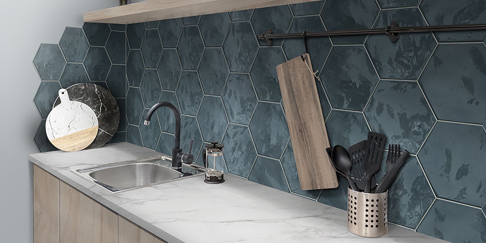
Placid has the perfect color palette for St. Patrick’s Day… errrr I mean for your design.
Placid’s collection is composed of a small scale porcelain hexagon mosaic and a large format ceramic hexagon wall tile. The collection’s color palette is based around 4 colors inspired by Scandinavian design: White Mix, Pink Mix, Blue Mix and Gray Mix. The ‘Mix’ mosaics have a mix of three finishes on the hexagons; there is a matte finish, a soft satin finish and a fabric like texture.
This Scandinavian based color palette is a great, but these colors don’t necessarily work for everyone, so the palette was rounded out. I’d like to call this collection of colors the ‘New Primary Color Palette’ because the palette is composed of traditional primary colors with a contemporary twist: there is a cherry red, a saturated forest green and ocean blue (which reminds me of the Multidimensional Blue.) This palette not only contains a matte porcelain hexagon, but also a large glossy ceramic hexagon which allows you to take your bold wall color onto the floor – not the easiest look to accomplish nowadays with the lack of colorful floor tiles.
THE TILE POINTS
[su_button url=’https://www.creativematerialscorp.com/product/placid/’ target=’blank’ title=’View the Placid Tile Collection’ background=’#3c3e41′ size=’10’]View the Placid collection or request a sample[/su_button]
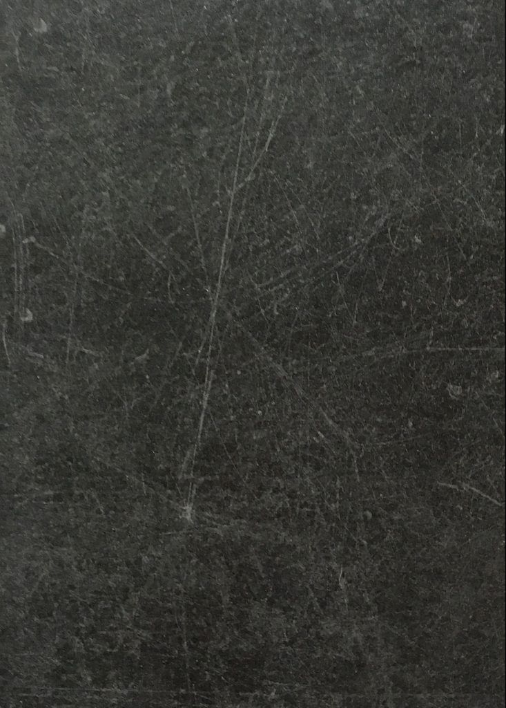
You may recognize the tile in this layout… it’s Walkway from our 2018 Spring Summer collection. As you can see from some of our new collections, the unique patterns, shapes, and decor allow for endless design possibilities. This is a good and bad thing… good for your design and the unique character you can add to the space; bad in that it is time-consuming diving into each collection and figuring out what pattern you can create. That’s where Creative Materials’ Design Services can help.
In preparation for our Spring|Summer, and Fall|Winter collections, I’ve had the opportunity to dive into each collection and see all the parts and pieces. Attending Cersaie and Coverings has allowed me to draw inspiration from the beautiful booth designs created at the tile showcases, and come up with my own ideas for what can be created.
Walkway was one of those collections. When you look at porcelain concrete tiles, you don’t see many options with scratched concrete aesthetics. This collection displays the color palette you expect to find with scratched concrete, but what elevates this aesthetic is the red colorway and the Angle decor. The moment I saw the Angle Decor, I was like ‘Ohhh you’re going to be able to create some cool looks with this tile.’
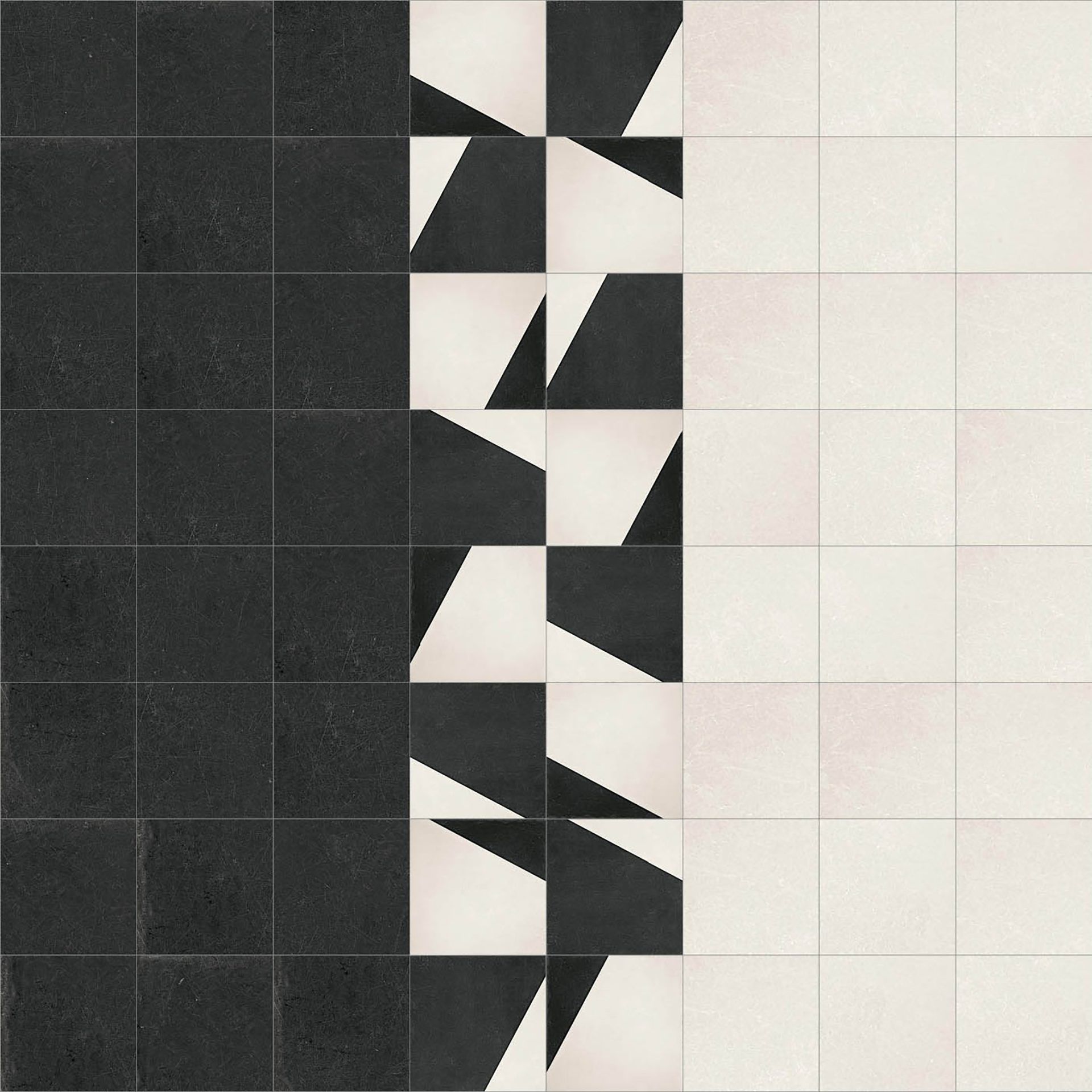
Design 1: Walkway Black Matte 30’x30′ field, Ivory Matte 30’x30′ and Black/ Ivory Angle Decor 30’x30′ fracturing the transition from Black to Ivory
THE DESIGNS
I have created three designs which utilize the Angle Decor to create different effects within the space.
In Designs 1 (shown above) + 2 (shown below), the Angle Decor acts as a transition strip between two colors, Black and Ivory. In Design 1, the Angle Decor fractures the plane between the Black and Ivory. The movement and placement of the Angles is more organic, while the placement of the Angles in Design 2 is more rigid. The Angles alternate Black dominate/ Ivory dominate, Ivory dominate/ Black dominate and vice versa along the border.
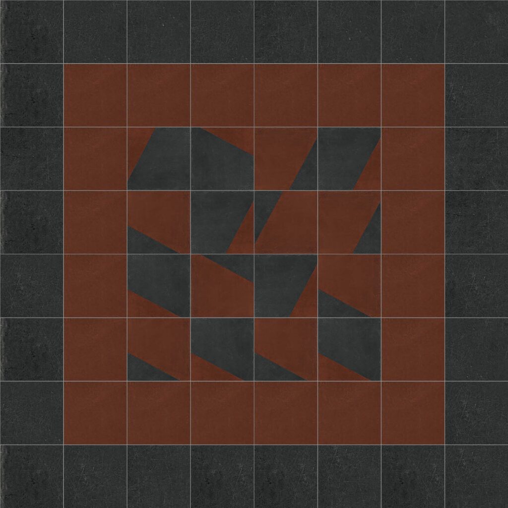
In Design 3, I envision the Black/ Red Angle Decor acting as an inset with a larger field of the Black surrounding it. I used the Red border to soften the transition to Black. I could also see the Red being scattered within the Black/ Red Angle Decor as well, if the inset needed to be larger to balance the expense of the Angle Decor.
The Angle Decor is a creative way to transition between two tile colors or create breaks/ insets within larger fields of tile. I could see these designs being used in an amenity space to transition between the path of travel to the seating area or an interesting element in the elevator lobby. Please feel free to contact Design Services if you are interested in exploring one of these designs for your project.
THE TILE POINTS