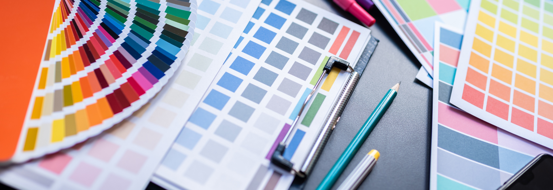
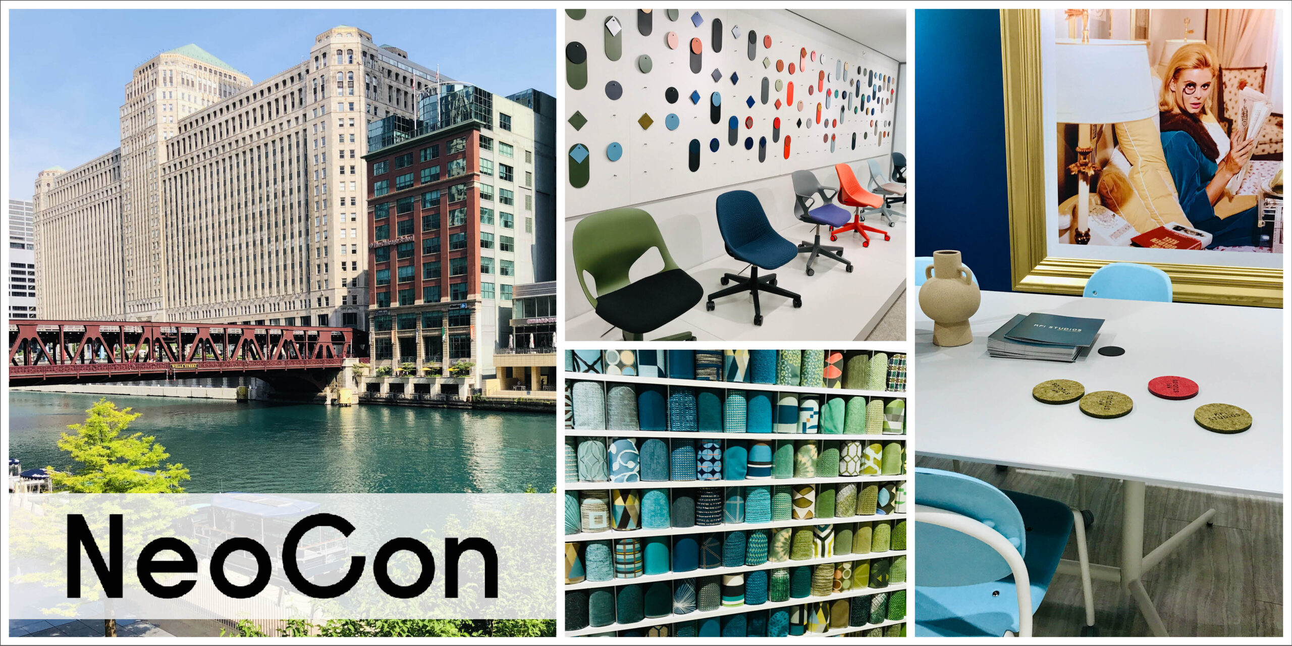
Defining Trends Discovered At NeoCon
NeoCon was back to its regularly scheduled programming in mid-June. This was my second time attending, (the first time was October 2021) and it seemed like it was back to its full grandeur; and boy, were my feet crying and my design brain overflowing after two days at the show.
There was SO much to see that it was challenging to narrow down what was a mainstream trend vs. micro trend (short term.) I think the first (2) trends will be more mainstream and my reason for this is the “hotelification” of the office. In this post-pandemic world, employees are looking for a change in their working environments and the open office style just isn’t working. Employees have been working in the comfort of their homes and to attract them back to the office, we need to look at the spaces we’re creating for them.
Designers are approaching office interiors as they might a high-end hotel; the spaces are “characterized by a warm, inviting ambiance, copious amenities, and designs that promote collaboration… cue highly functional and flexible pieces with a big dose of comfort, beauty, and colors in calming palettes.” Floor Covering News
As for the second (2) trends, I’d like to think that these could be mainstream because I love the softness that curvilinear forms are bringing to spaces, along with the sunset color palettes; however, I think these trends are a reaction to the office environments we were in before the pandemic… furniture having very clean lines, angular and sleek, and grey, I think everything was grey. I hope I’m wrong on these trends because I really like them, but only time will tell if they hang around or fade into design history.
Here are the defining trends that we saw at NeoCon 2022…
Texture was everywhere and anywhere you looked at NeoCon. From furniture to fabric to flooring, manufacturers were playing with and contrasting textures. I’m not just talking about actual textures; they were also working with visual textures as well.
Visual textures, like patterns, were layered on top of each other, balancing each other out. Actual or physical textures like heavy woven fabrics were mixed with tight weaves, and textured wood grains were contrasted against matte lacquered finishes.
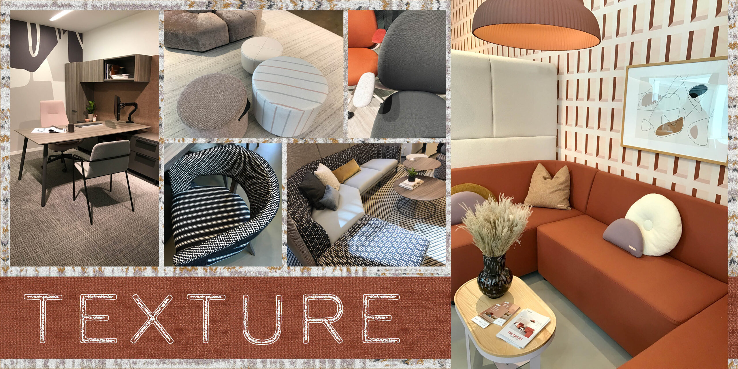
We saw textures in the form of: sculptural carpet tiles playing with pile heights; every type of velvet imaginable from mohair to crushed to embossed on chairs, pillows, and stools; plain sawn wood finishes on desktops juxtaposed smooth, soft laminated vertical surfaces; different sized checkerboard patterned area rugs were layered with patterned upholstery.
Manufacturers to look at: Hightower, Kimball International, Allsteel, Shaw Contract, Interface
I’m definitely feelin’ the biophilic designs that furniture and fabric manufacturers are incorporating into their products. I felt like I was walking into a greenhouse or a dried flower shop with all the plants and dried flowers incorporated into tables and seating. It was very cool and made the spaces feel alive with the integration of an organic element.
We also saw deep greens incorporated into systems furniture, another way manufacturers were bringing the outside in. Wallcovering and fabric manufacturers were bringing playful elements of nature into their designs.
From a sustainability perspective, we saw a couple of companies doing some interesting stuff while keeping the environment in mind.
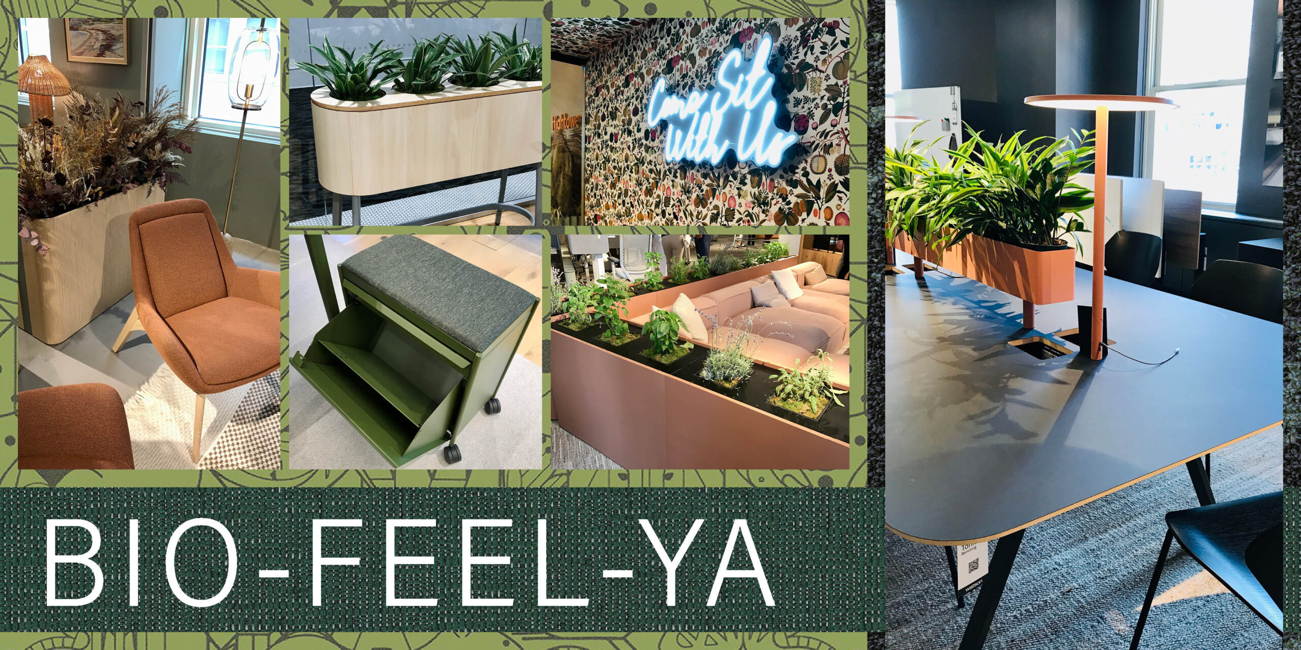
KFi Studios’ Jade chair was designed to eliminate the use of new plastic. They created a PET felt, made from recycled plastic, that has the look and softness of felted wool. I was shocked when I saw it and couldn’t believe it was plastic.
Watson Furniture has partnered with Forbo to create Linoleum Laminate tabletops, that are made of sawdust, vegetable linseed oil, and pine rosin. This green product has a leather-like texture, and a much more appealing finish than plastic laminates, both aesthetically and environmentally.
We saw bio-feel-ya in the form of: live greenery and dried flowers incorporated into bookcases, privacy screens, tabletops, and sectionals; environmentally friendly materials incorporated into furniture; fabric, and wallcovering patterns and materials.
Manufacturers to look at: Hightower, OFS, Kimball International, Watson, Designtex, KFi Studios, Allsteel
There was a warmth and softness to a lot of the spaces we saw at NeoCon. One could attribute that to the color palettes, but there was another design element contributing to that feeling, and it was the curvilinear forms.
Rounded table corners, sloping table profiles, and oblong tabletops brought softness to office spaces and facilitated the flow of the space (and didn’t hurt when you walked into them.)
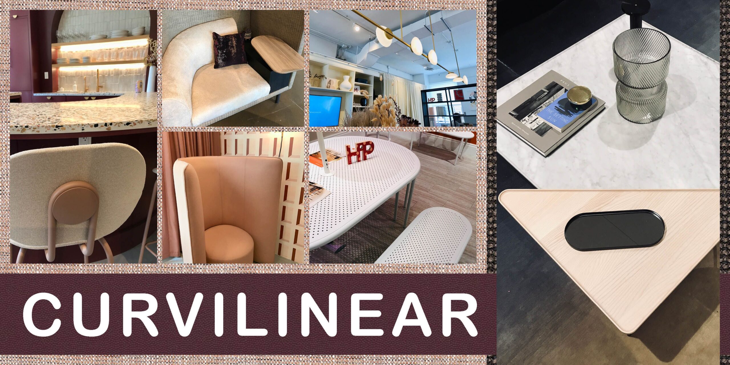
We saw curvilinear forms in: cylindrical ottomans and stools; rounded and sculpted corners; curved and flared chair backs; disc-like and S-curved lighting; and oblong seating and décor, just to name a few examples.
Manufacturers to look at: Hightower, OFS, Haworth, KFi Studios, Watson
NeoCon was full of color this year, it ranged from muted and saturated to blue and green jewel tones to an explosion of reds and oranges. The red and orange palettes were interesting because of their gradient and range. I overheard sunset being mentioned when some designers were discussing color palettes they saw, and I think a sunset perfectly captures this color palette and the range of colors we saw.
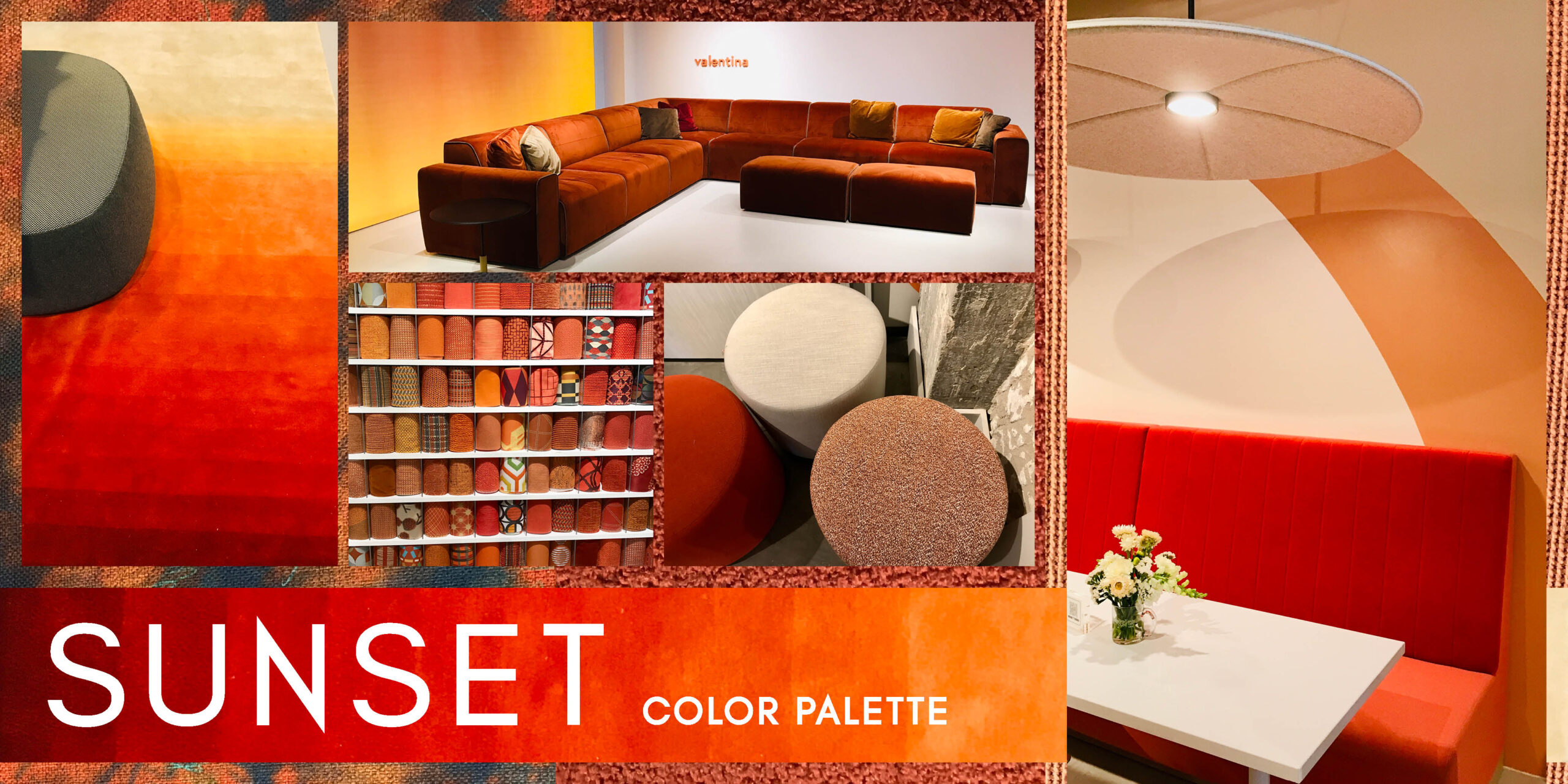
This bold color palette focuses on reds to oranges to punches of electric peach, the colors you can find in a sunset on any given day. In some spaces, reds and oranges were used together to create an eye-catching moment, and other spaces used electric peach as the defining accent color. These colors are beautiful, bright, and bold, and something that we’ve needed after years of grey interiors.
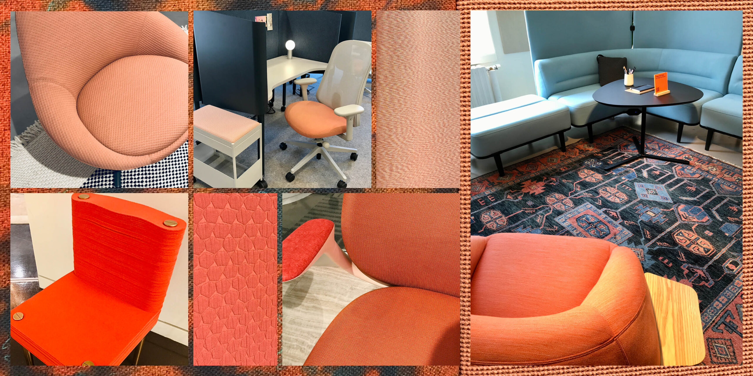
We saw the sunset color palette in the form of: upholstery, area rugs, acoustic panels and light fixtures, and wallcoverings
Manufacturers to look at: ERG International, Allermuir | Senator, Haworth, Bernhardt, Miller Knoll
For quite a few years now, I’ve been bringing you the latest ceramic and porcelain tile trends. It was nice stepping out of the tile box and looking at what is going on in the rest of the commercial design industry and seeing the similarities in both areas.
In the June edition of Erin’s Picks, I discussed the Captivating Color Trend in ceramic and porcelain tiles, and you’ll see those color palettes definitely complement the palettes and finishes we saw at NeoCon.
Did you attend NeoCon? If so, what was your favorite trend from the show?
Until next time…
E